The Dramatic Password Reveal
As far back as I can remember – which admittedly isn’t very far – GUI toolkits have included a special type of text entry field for passwords. As you type, the password field displays a generic character, usually a dot or asterisk, instead of the character you actually typed.
I’ve criticized the login dialog before, but I definitely understand the need to obfuscate password entry, even if you’re using fancy two-factor authentication with smart cards and the like. If password entry was treated as plain old text entry, you’d reveal your password (or PIN code) to anyone who casually happened to be looking at the screen while you’re typing. So instead of seeing:
**************
Everyone in your meeting or presentation would instead see:
IHeartBunnies!
Which would be sort of traumatic on several levels. Not to mention the security implications.
I can’t talk about login dialogs without bringing up one in Lotus Notes 6.0. Like everything else in Notes, it’s a massive train wreck.
This dialog box contains several security “features”:
- The hieroglyphics on the left of the dialog box are supposed to distract anyone who is peering over your shoulder trying to learn your password as you type.
- The number of characters you type is hidden; a random number of X’s appear instead of one asterisk per character.
Is any of this nonsense really necessary? If I want to learn someone’s password as he or she types it, I will look at the keyboard, not the screen!
I actually had to use that exact login dialog for my job at the time, and I can tell you from personal experience exactly how mind-bendingly, appallingly awful it truly was. Who reinvents a perfectly standard dialog – and makes it so much worse? On second thought, perhaps “how can we make this worse?” was the design goal for Notes. It certainly felt that way while I was using it.
But I digress. As much as we worry about password obfuscation, at least one dialog in Vista bucks this long-standing GUI trend. Specifically, the dialog where you enter your wireless network password.
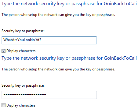
Checking the “display characters” checkbox overrides the password obfuscation and reveals the password. At first I was appalled. Reveal my password? Imagine the security implications! The chutzpah of Microsoft’s developers, putting my password at risk in such a careless, haphazard manner! What were they thinking?
I’m guessing they implemented the reveal option here because network passwords can be unusually long and complex – and troubleshooting network connectivity is difficult enough even without factoring in the inevitable password typos. But are network passwords really so different from any other type of password? After using this dialog a few times, I began to see how useful the reveal password option truly was. If you think you’ve made a mistake entering your password, tick the reveal box and find out. It’s quite a time saver compared to typing in your password in blindly two, three, or even four times before getting it right. I don’t know about you, but that happens to me at least a few times a day on average.
I’ve come full circle. I now think the password reveal option should be available on all login dialogs.
It’s awfully convenient, and it doesn’t seem particularly risky to me. Nobody leaves their password typed in and waiting to be revealed on the login screen. If you’re in a public place, you simply refrain from using the reveal option. But at home or in a private work area, why not opt to reveal your password? Traditional GUI password obfuscation is a nice convention, but it’s not the alpha and omega of password security. Far from it. If criminals really want to get your password, they’ll be watching your fingers on the keyboard or using keylogger hardware.


