Removing The Login Barrier
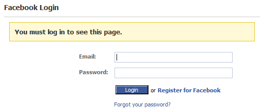
Dare Obasanjo’s May 26th thoughts on the Facebook platform contained a number of links to the Facebook API documentation. At the time, clicking through to any of the Facebook API links resulted in a login dialog:

It struck me as incredibly odd that I had to login just to look at API documentation. When presented with the login barrier, I did what 99% of all the people who encounter a login barrier do: I turned back. Dare seemed excited about the Facebook API, but I lost interest when confronted with this login screen.
Wouldn’t you want information about your API disseminated as widely as possible, to as many people as possible? To be fair, Facebook has since rectified this problem. Clicking on the link now takes you directly to the Facebook API documentation with no login barrier. I’m not so sure the Facebook folks are “brilliant on several levels” if their API documentation was placed behind a login barrier, even if for only a few days.
I previously referenced Jan Miksovsky’s enumeration of login steps as a type of user interface friction. But in reality, login barriers are far worse than friction – they’re a brick wall. Login barriers are a no-win situation for users. What’s in it for them? And without sneaking behind the barrier, if only for a moment, how can the user possibly know if your site is worth the hassle of signing up? If you’re the New York Times, maybe you can get away with forcing users to deal with the login barrier before getting to the meat of your website. But most of us will never have that much cheese.
Even if you can’t avoid an eventual login, it is possible to make the user’s login process nearly seamless. Too many sites take a ham-handed, completely traditional approach to logins. You can do much, much better than the abysmal login barrier status quo. Jan doesn’t mince any words when he says Geni has the most inviting initial user experience he’s ever seen:
Right off the bat, you’re cleverly dropped into a family tree that’s already partially started: there’s a place for you, and obvious points to add your parents. No fanfare is needed to introduce the site or explain what it’s for. The very nature of the task’s UI makes it obvious that you’re building a family tree.
You’re asked for an email address, and in the most compact text imaginable, they define the key points of their privacy policy (“never spammed, never shared”).
It’s not advertised to the user at this point that the email address they enter for themselves will become their user ID on the site. This is revealed the first time the user tries to return to the site. At that point – the second visit – the user is asked to sign in with their email address and a temporary password that was emailed separately to that address.
It’s obvious that Jan has been thinking a lot about this topic; he has a follow up post describing how Netvibes and Pageflakes ease visitors into sites with anonymous accounts:
These sites both use cookies to establish a tentative, anonymous relationship between you and the site. You can even enter personal data to customize the various widgets, but until you’ve established an account, you’re generally using the service anonymously. (Of course, even without a user ID, each additional piece of data you enter to customize the site can be used to more precisely identify you.)
You can use your anonymous account for as long as you want to, provided you use the same browser on the same machine to do so. Whenever you reach that point – maybe even months after starting to use the service – you can sign up for an account. The basis of your relationship with the site transfers from your anonymous browser cookie to a real account secured with a user ID and a password. (Both these sites use your email address as a user ID, to eliminate the signup hurdle of picking a user ID.)
The deep principle at work is that a site doesn’t need to rush to secure a relationship with a visitor. Inevitable interest in getting more out of the site (in these cases, the desire to use your customized home page from another location) slowly pushes you, the casual anonymous visitor, to finally forge a permanent relationship with the site as an identified user. The site knows a relationship with you will develop in its own time.
If your application requires users to log in, don’t underestimate the impact of the login barrier you’re presenting to users. Consider utilizing anonymous, cookie-based accounts to give users a complete experience that more closely resembles the experience that named users get. By removing the login barrier and blurring the line between anonymous users and named users, you’re likely to gain a lot more of the latter.


