Coding Horror

programming and human factors

Giving Up on Microsoft

Although I am generally platform agnostic, I make no secret of the fact that I am primarily a Microsoft developer. In a way, I grew up with Microsoft-- as a teenager, I cut my programming teeth on the early microcomputer implementations of Microsoft BASIC. And I spent much of my professional life writing Visual Basic code. When Microsoft rebooted their programming franchise with .NET in 2003, I was thrilled and reinvigorated, glad to finally have a viable exit strategy from the glass house that was Visual Basic.

As a developer who grew up on a steady diet of Microsoft tools, I never understood the pockets of rabid anti-Microsoft sentiment in the programming community. To me, Microsoft was the least of all possible commercial evils, a generally benevolent dictatorship. Humor me for a moment and imagine replacing Microsoft with one of its competitors: Sun, IBM, Oracle, or Apple. I don't know about you, but those alternate histories send a chill up my spine. Yes, Microsoft is a near-monopoly, but as giant, evil monopolistic corporations go, you could do a lot worse. Microsoft is far from perfect, but they generally do the right thing as far as I'm concerned.

Microsoft has always been a developer-centric company to their very core. From Steve Ballmer's developers, developers, developers, to Bill Gates' centerfold shot, it's always been abundantly clear that Microsoft is a company which prides itself on taking care of its core constituency: developers.

Bill Gates, CEO of Microsoft, reclines on his desk in his office soon after the release of Windows 1.0. 1985 Bellevue, Washington, USA

Although I'm still satisfied with my place in the Microsoft development universe, some developers desperately want off the Microsoft treadmill. Mike Gunderloy is a notable example:

I've spent the bulk of the last fifteen years developing some amount of reputation and expertise in the Microsoft universe, having published dozens of books and hundreds of articles, worked as an editor and consultant, written (as a subcontractor) parts of various Microsoft products, and so on. I'm also the editor of the Larkware site, which tracks news in the Microsoft software world for developers.

Unfortunately, over that time I've also come to the conclusion that, even though it is staffed largely by smart and ethical people, Microsoft itself represents a grave threat to the future of software development through its increasing inclination to stifle competition through legal shenanigans. Its recent attempt to claim that no one can implement a user interface that looks anything like the Office 2007 ribbon without licensing some nebulous piece of intellectual property represents a new low in this regard.

I'm in a bit of a bind. Unlike fifteen years ago, I've got a family, including four kids, and I can't afford to just walk out on a career that brings in good money. But I rather desperately want to find an alternative. This blog will record some of my explorations as I hunt around in other corners of the software world, trying to decide if there's a viable business plan for me that can include weaning myself off of Microsoft software.

Mike started a new blog, A Fresh Cup, where he's reinventing himself as an open-source developer. If you were wondering why the content at Larkware's Daily Grind has degenerated so much recently (and boy, has it ever), now you know. His heart's just not in it any more.

I can understand where Mike is coming from. Microsoft releases new technology at a blistering pace, and keeping up-- not to mention dealing with all the obsolete baggage you're carrying around-- is half the challenge. Just take a look at the stack I have to install on my development machine to do development work in .NET 3.0:

  • Windows Vista
  • Visual Studio 2005
  • Visual Studio 2005 Team Explorer (source control)
  • Orcas Extensions for Visual Studio 2005 (WPF & WCF project templates)
  • SQL Server Express SP2
  • Visual Studio 2005 SP1
  • Visual Studio 2005 SP1 Update for Vista
  • ASP.NET 2.0 AJAX Extensions 1.0
  • Expression Blend

Historically, I've used Microsoft development environments because they made my life easier. It's hard to look at this list and see how it's any easier than the open source alternatives. I also begin to look longingly at the open source developers who have been plugging away productively in Perl or Python over the last five years. Sometimes, you wonder if choosing an environment where things change more slowly isn't a better long term evolutionary decision. Perhaps there's a kernel of truth in Paul Graham's sensationalist Microsoft is Dead article: can you even name any startups that use Microsoft development tools?

So part of me agrees with Mike. To paraphrase Chris Rock: I'm not saying he should have given up on Microsoft. But I understand.

Mike's certainly entitled to take whatever steps he deems necessary for his professional development. Still, his attitude frustrates me, because it falls so egregiously into the stereotypical, religious love/hate dichotomy that I've observed again and again in software developers. You either love Microsoft and use exclusively Microsoft products, or you hate Microsoft, and you vow never to use any of their products ever again. There's nothing in between. No middle ground. Why does it have to be an all or nothing proposition? As far as I'm concerned, every software developer, regardless of what's on their tool belt, has the same goal: to craft useful computer software that delights users. We're allies, not enemies. Friendly rivalry I can understand. But the rabid partisanship that I typically see-- on both sides of the fence-- isn't helping us.

I also find that both the Microsoft community and the open-source communities are far too insular and provincial. I had the great pleasure of meeting Miguel de Icaza at MIX this year. Miguel is one of my heroes, as he was instrumental in bringing .NET to the world of open source with the Mono project. What truly surprised me, though, was how few MIX attendees knew who Miguel was, despite his groundbreaking contribution to the .NET programming ecosystem. To me, he's famous. A celebrity. But because Miguel has roots in the open-source community, he barely exists to the majority of Microsoft-centric developers. They didn't even know who he was! And those who did recognize him had about a 50/50 chance of disliking him on principle. As Miguel pointed out during the open source panel, he's disliked by both camps: open-source zealots think he's sold out to Microsoft, and Microsoft zealots think he's destroying the value of the .NET platform.

This is wrong. This is not the way things should be.

As a software developer, you're doing yourself a disservice by pledging allegiance to anything other than yourself and your craft-- whether it's Microsoft or the principle of free software. Stop with the us vs. them mentality. Let go of the partisanship. We're all in this thing together.

I'm a pragmatist. For now, I choose to live in the Microsoft universe. But that doesn't mean I'm ignorant of how the other half lives. There's always more than one way to do it, and just because I chose one particular way doesn't make it the right way-- or even a particularly good way. Choosing to be provincial and insular is a sure-fire path to ignorance. Learn how the other half lives. Get to know some developers who don't live in the exact same world you do. Find out what tools they're using, and why. If, after getting your feet wet on both sides of the fence, you decide the other half is living better and you want to join them, then I bid you a fond farewell.

But either way, we're still friends.

Discussion

Your Favorite Programming Quote

My all-time favorite programming quote has to be this Nathaniel Borenstein bon mot:

It should be noted that no ethically-trained software engineer would ever consent to write a DestroyBaghdad procedure. Basic professional ethics would instead require him to write a DestroyCity procedure, to which Baghdad could be given as a parameter.

It's too perfect. Never have programmers been more neatly summarized.

There are a few great collections of programming quotes on the web which are fun to browse through:

If I find a quote that resonates with me, I research the person behind the quote. Larry Wall is a good example:

I think that the biggest mistake people make is latching onto the first idea that comes to them and trying to do that. It really comes to a thing that my folks taught me about money. Don't buy something unless you've wanted it three times. Similarly, don't throw in a feature when you first think of it. Think if there's a way to generalize it, think if it should be generalized. Sometimes you can generalize things too much. I think like the things in Scheme were generalized too much. There is a level of abstraction beyond which people don't want to go. Take a good look at what you want to do, and try to come up with the long-term lazy way, not the short-term lazy way.

Jason Kottke did most of the work for me by putting together a great Larry Wall reading list:

If that's too much rah-rah Perl action for you, read this article questioning the future of Perl in Bugzilla to get some equal time. But I don't have to dogmatically accept Perl to respect Larry Wall. I doubt Larry would want me to, anyway. It's not about the language; it's about learning to understand programmers as human beings.

You can't know every notable personality in the field of computer science. But reading through some of their quotes is as good a place as any to start. It's one way to find out, at least peripherally, who the giants are in the industry, and what they're most famous for. Browsing through quotes also lets you figure out who your influences are-- or should be. Personally, I'd cite Jef Raskin and Steve McConnell as my two greatest influences.

Who are the greatest influences on your work as a software developer? And more importantly, what's your favorite quote from your influences?

Discussion

Phishing: The Forever Hack

Most of the hacking techniques described in the 1994 book Secrets of a Super-Hacker are now laughably out of date. But not all of them. A few are not only still effective, but far more effective in the current era of ubiquitous internet access. As the author notes early in the book, some attacks are timeless:

Hacking may seem harder than before, but it really isn't. The culture may have become more aware of security, but the individual user still lives in a world of benign indifference, vanity, user-friendliness, and friendly-userness. Users who are in-the-know will always want to help the less fortunate ones who are not. Those who aren't will seek the advice of the gurus. And so social engineering and reverse social engineering live on, as you shall discover in these pages.

Ease of use will always rule. The "dumb" password will be a good guess for a long time to come. People just don't choose "6Fk%810(@vbM-34trwX51" for their passwords.

Add to this milieu the immense number of computer systems operating today, and the staggering multitudes of inept users who run them. In the past, computers were used by the techno-literate few. Now they are bought, installed, used, managed, and even programmed by folks who have a hard time getting their bread to toast light brown. I'm not denigrating them -- I applaud their willingness to step into unfamiliar waters. I just wish (sort of) that they would realize what danger they put themselves in every time they act without security in mind.

I don't think there's any better illustration of the timelessness of social engineering hacks-- and the vulnerability of unsophisticated mainstream users-- than phishing. The results of a 2006 phishing study, Why Phishing Works (pdf), are truly sobering:

  • Good phishing websites fooled 90% of participants.
  • 23% of participants in the study did not look at the address bar, status bar, or the security indicators.
  • On average, the participants incorrectly judged whether a website was real or a spoof 40% of the time.
  • 15 out of 22 participants proceeded without hesitation when presented with popup warnings about fraudulent certificates.
  • Neither education, age, sex, previous experience, nor hours of computer use showed a statistically significant correlation with vulnerability to phishing. Everyone was vulnerable.

Phishing is remarkably effective. Bear in mind that the users in this study were told in advance to expect a mixture of real and fake websites, so these results may actually be better than real world performance, as hard as that is to believe. Here's a detailed breakdown of the test sites used in the study, along with the percent of users who were unable to correctly identify whether the site was real or a spoof:

% Wrong
Bank of the West Spoof URL (bankofthevvest.com), padlock in content, Verisign logo and certificate validation seal, consumer alert warning 91
PayPal Spoof Uses Mozilla XML User Interface Language (XUL) to simulate browser chrome w/ fake address bar, status bar and SSL indicators 81
Etrade Real 3rd party URL (etrade.everypath.com), SSL, simple design, no graphics for mobile users 77
PayPal Spoof URL (paypal-signin03.com), padlock in content 59
PayPal Spoof URL (IP address), padlock in content 59
Capital One Real 3rd party URL (cib.ibanking-services.com), SSL, dedicated login page, simple design 50
PayPal Spoof Screenshot of legitimate SSL protected Paypal page within a rogue web page 50
Ameritrade Spoof URL (ameritrading.net) 50
Bank of America Spoof Rogue popup window on top of legitimate BOFA homepage, padlock in content 36
Bank of the West Spoof URL (IP address), urgent anti-fraud warnings (requests large amount of personal data) 32
USBank Spoof URL (IP address), padlock in content, security warnings, identity verification (requests large amount of personal data) 32
Ebay Spoof URL (IP address), account verification (requests large amount of personal data) 32
Yahoo Spoof URL (center.yahoo-security.net), account verification (requests large amount of personal data) 23
NCUA Spoof URL (IP address), padlock in content, account verification (requests large amount of personal data) 18
Ebay Real SSL protected login page, TRUSTe logo 14
Bank Of America Real Login page on non-SSL homepage, padlock in content 14
Tele-Bears (Student Accounts) Real SSL protected login page 9
PayPal Real Login page on non-SSL homepage, padlock in content 9
Bank One Real Login page on non-SSL homepage, padlock in content 0

There's only one conclusion you can draw from the study's results: when presented with a spoofed web page, a large percentage of users will always fall for it. Forever.

Once that spoofed page is up, even if we use the extraordinarily optimistic estimate that only 15 percent of users will fall for it, that's still a tremendous number of users at risk. Given the poor statistics, the only mitigation strategy that makes sense is to somehow prevent showing the spoofed page to the user. The good news is that the latest versions of Firefox and Internet Explorer have anti-phishing capabilities which do exactly that: they use real-time, distributed blacklists to prevent showing known spoof sites to users. I visited the PhishTank site to gather a set of known phishing URLs to see how well these browsers perform.

Firefox may be using PhishTank as a source; every URL I visited showed the most severe warning, blocking the phishing site from the user behind a sort of smoked glass effect. Unfortunately, it's all too easy to click the little red X and use the page. I don't think it's a good idea for this dialog to be so easily dismissable, like any other run of the mill dialog box.

Firefox: suspected web forgery

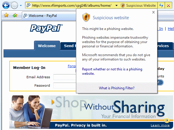
IE7 opened some of the recent phishing sites with no warnings at all. But a few triggered the heuristic check for "suspicious", with a dropdown warning obscuring part of the site:

Internet Explorer 7: suspicious website

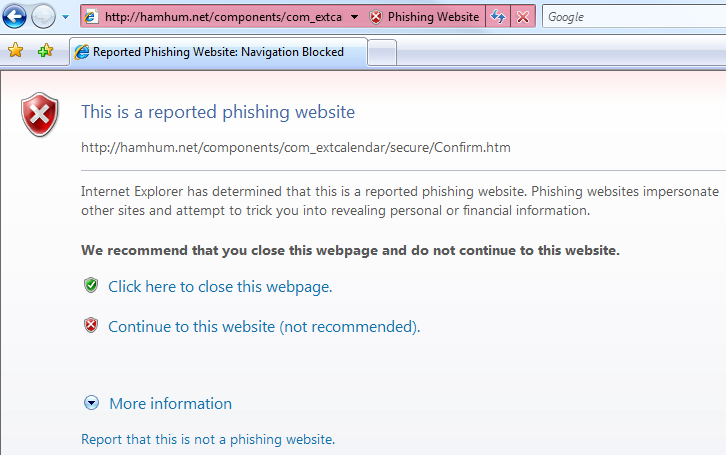
Others made the IE7 blacklist and were blocked completely behind a gateway page. I prefer this to the Firefox approach; once the URL is reported as a phishing site, there's absolutely no reason to show any of its content to the user.

Internet Explorer 7: reported phishing website

I'm no fan of distributed blacklists, but I think they're a necessary evil in this case. Throughout the last ten years of incremental browser security improvements, users have always been susceptible to spoof attacks. It doesn't matter how many security warnings we present, or how much security browser chrome we wrap websites in. Phishing is the forever hack. If the phishing page is displayed at all, it invariably reels a large percentage of users in hook, line, and sinker. The only security technique that can protect users from phishing scams, it seems, is the one that prevents them from ever seeing the phishing page in the first place.

Discussion

Maximizing The Value of Your Keystrokes

I met Jon Udell this year at MIX. I was reading through his excellent blog to flesh out some of the topics we talked about, when I was struck by the powerful message of this particular entry:

When people tell me they're too busy to blog, I ask them to count up their output of keystrokes. How many of those keystrokes flow into email messages? Most. How many people receive those email messages? Few. How many people could usefully benefit from those messages, now or later? More than a few, maybe a lot more.

From this perspective, blogging is a communication pattern that optimizes for the amount of awareness and influence that each keystroke can possibly yield. Some topics, of course, are necessarily private and interpersonal. But a surprising amount of business communication is potentially broader in scope. If your choice is to invest keystrokes in an email to three people, or in a blog entry that could be read by those same three people plus more -- maybe many more -- why not choose the latter? Why not make each keystroke work as hard as it can?

hands blurred, typing on a keyboard

[converting an email to a blog entry] can have powerful network effects. To exploit them, you have to realize that the delivery of a message, and the notification of delivery, do not necessarily coincide. Most of the time, in email, they do. The message is both notification and payload. But a message can also notify and point to a payload which is available to the recipient but also to other people and processes in other contexts. That arrangement costs hardly any extra keystrokes, and hardly any extra time. But it's an optimization that can radically expand influence and awareness.

I covered similar ground in When In Doubt, Make It Public, but Jon's entry is even more compelling. It's a specific example of how you can adapt your behavior to have a much broader impact. What Jon's describing happens to me all the time. I'll be in the middle of composing an email when I suddenly realize that there's no reason to silo this information in a private email exchange. I convert that email into a blog entry. Now, anyone who is interested in the topic can find it and have a public conversation with me-- and everyone else-- about it.

The next time you find yourself typing more than a few sentences on your keyboard, stop and ask: are you maximizing the value of your keystrokes?

Discussion

Basic Design Principles for Software Developers

In my previous post, I urged developers to learn a mainstream graphics editing program. This is purely a mechanical skill, so it seemed reasonable for developers to give it a shot. If we can absorb extremely complex development environments, compilers, and databases, why not a graphics editor? But as a few commenters pointed out, competence in a graphics editor isn't enough; you also have to learn some basic design principles to use the tool effectively. Turn the tables for a moment: would it be reasonable to expect designers to learn our favorite development IDE, purely as a tool, without any guidance on how to write code, too?

Probably not. That's why I'm so glad Graham Stewart reminded me to mention The Non-Designer's Design Book.

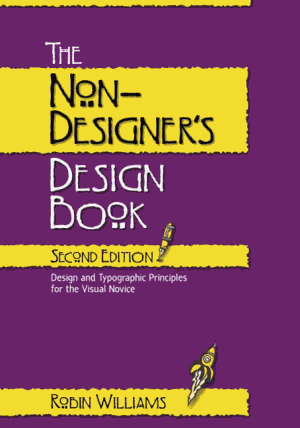
The Non-Designer's Design Book cover

I bought my copy of this book way back in 1996, when I was a software developer with zero design skills, looking for a little guidance. I'm not a designer now by any means – but when you start at zero, there's nowhere to go but up. I love the opening quote from the book, which touches on a theme I discussed recently that got a lot of press:

More matter is being printed and published today than ever before, and every publisher of an advertisement, pamphlet, or book expects his material to be read. Publishers, and even more so, readers want what is important to be clearly laid out. They will not read anything that is troublesome to read, but are pleased with what looks clear and well arranged, for it will make their task of understanding easier. For this reason, the important must stand out and the unimportant be subdued...

The technique of modern typography must also adapt itself to the speed of our times. Today, we cannot spend as much time on a letter heading or other piece of jobbing as was possible even in the nineties.

In the above quote by Jan Tschichold, he's referring to the eighteen-nineties. The quote dates back to 1935, but it's as true today as it ever was.

The book does look suspiciously amateurish, with its garish purple and yellow cover and odd font choices. Nonetheless, I found The Non-Designer's Design Book to be a tremendously helpful introduction to practical, real world design principles for a neophyte. Paging through it today, it's still as useful and interesting as ever. It outlines the first baby step towards a lifelong design education in clear, simple terms:

Many years ago I received a tree identification book for Christmas. I was at my parents' home, and after all the gifts had been opened I decided to go out and identify the trees in the neighborhood. Before I went out, I read through part of the book. The first tree in the book was the Joshua tree because it only took two clues to identify it. Now the Joshua tree is a really weird-looking tree and I looked at that picture and said to myself, "Oh, we don't have that kind of tree in Northern California. That is a weird-looking tree, and I've never seen one before."

So I took my book and went outside. My parents lived in a cul-de-sac of six homes. Four of those homes had Joshua trees in the front yard. I had lived in that house for thirteen years, and I had never seen a Joshua tree. I took a walk around the block, and there must have been a sale at the nursery when everyone was landscaping their new homes– at least 80 percent of the homes had Joshua trees in the front yards. And I had never seen one before! Once I was conscious of the tree – once I could name it – I saw it everywhere.

You begin at the beginning: by learning to see the design all around you. All it takes to distinguish yourself is a little judicious application of the design guidelines in this book– guidelines so universal they apply to web sites as easily as they do to traditional client GUI applications. And once you do, you'll begin to see how these rules apply everywhere.

I'm sure there are other good introductory design books out there. I can personally vouch that this one stands the test of time. The author produced a number of related books, but the reviews on those are mixed at best; most point back to this classic. And here's one clever little feature of this book that I just noticed after all these years– instead of Lorem Ipsum dummy text, the author uses Anguish Languish, which is way more fun.

Discussion