Judging Websites
I was invited to judge the Rails Rumble last year, but was too busy to participate. When they extended the offer again this year, I happily accepted.
The Rails Rumble is a distributed programming competition where teams of one to four people, from all over the world, have 48 hours to build an innovative web application, with Ruby on Rails or another Rack-based Ruby web framework. After the 48 hours are up, a panel of expert judges will pick the top ten winners.
I received an email notifying me that judging begins today, so I cracked my knuckles, sat down in front of my three monitors (all the better to judge with!) and… saw that there were around 340 entries.
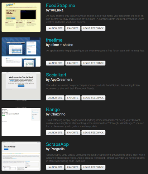
That’s when I started to get a little freaked out about the math. Perhaps we can throw 5% of the entrants out as obviously incomplete or unfinished. That leaves 323 entries to judge. Personally, I’m not comfortable saying I judged a competition unless I actually look at each one of the entries, so at an absolute minimum I have to click through to each webapp. Once I do, I couldn’t imagine properly evaluating the webapp without spending at least 30 seconds looking at the homepage.
Let’s be generous and say I need 10 seconds to orient myself and account for page load times, and 30 seconds to look at each entry. That totals three and a half hours of my, y’know, infinitely valuable time. In which I could be finding a cure for cancer, or clicking on LOLcats. I still felt guilty about only allocating half a minute per entry; is it fair to the contestants if I make my decision based on 30 seconds of scanning their landing page and maybe a few desultory clicks?
But then I had an epiphany: yes, deciding in 30 seconds is totally completely unfair, but that’s also exactly how it works in the real world. Users are going to click through to your web site, look at it for maybe 30 seconds, and either decide that it’s worthy, or reach for the almighty back button on their browser and bug out. Thirty seconds might even be a bit generous. In one Canadian study, users made up their mind about websites in under a second.
Researchers led by Dr. Gitte Lindgaard at Carleton University in Ontario wanted to find out how fast people formed first impressions. They tested users by flashing web pages for 500 milliseconds and 50 milliseconds onto the screen, and had participants rate the pages on various scales. The results at both time intervals were consistent between participants, although the longer display produced more consistent results. Yet, in as little as 50 milliseconds, participants formed judgments about images they glimpsed. The “halo effect” of that emotional first impression carries over to cognitive judgments of a web site’s other characteristics including usability and credibility.
The opportunity cost to switch websites is one tiny little click of the mouse or tap of the finger. What I learned from judging the Rails Rumble most of all is that your website’s front page needs to be kind of awesome. It is never the complete story, of course, but do not squander your first opportunity to make an impression on a visitor. It may be the only one you get.
I’m not sure I was learning much about these apps while I judged, and for that I am truly sorry. But along the way I accidentally learned a heck of a lot about what makes a great front page for a web application. So I’d like to share that with you, and all future Rails Rumble entrants:
- Load reasonably fast.
I’ve talked about performance as a feature before; the sooner the front page of your site loads, the sooner I can decide whether or not I am interested. If you are slow, I will resent you for being slow, and the slower you are the more I will resent you for keeping me from not just finding out about you but also keeping me from moving on to the next thing. I need to be an efficient informavore. That means moving quickly. Above all else, load fast. - What the %#!@^ is this thing?
The first challenge you have is not coding your app. It is explaining what problem your app solves, and why anyone in the world would possibly care about that. You need an elevator pitch on your front page: can you explain to a complete stranger, in 30 seconds, why your application exists? Yes, writing succinctly and clearly is an art, but keep pounding on that copy, keep explaining it over and over and over until you have your explanation polished to the fine sheen of a diamond. When you’re confident you could walk up to any random person on the street, strike up a conversation about what you’re working on, and not have their eyes gloss over in boredom and/or fear – that’s when you’re ready. That’s the text you want on your home page. - Show me an example.
OK, so you’re building the ultimate tool for cataloging and sharing Beanie Babies on Facebook. Awesome, let me be an angel investor in your project so I can get me a piece of those sweet, sweet future billions. The idea is sound. But everyone knows that ideas are worthless, whereas execution is everything. I have no clue what the execution of your idea is unless you show it to me. At the very least throw up some screenshots of what it would look like if I used your webapp, with some juicy real world examples. And please, please, please, for the love of God please, do not make me sign up, click through a video, watch a slideshow, or any of that nonsense. Only emperors and princes have that kind of time, man. Show, don’t tell. - Give me a clear, barrier-free call to action.
In the rare cases where the app passes the above three tests with flying colors, I’m invested: I am now willing to spend even more of my time checking it out. What do I do next? Where do I go? Your job is to make this easy for me. I call this “the put a big-ass giant obvious fluorescent lime green button on your home page” rule. You can have more than one, but I’d draw the line at two. And make the text on the button descriptive, like Start sharing your favorite Beanie Babies → or Build your dream furry costume →. If you require login at this point, I strongly urge you to skip that barrier and have a live sample I can view without logging in at all, just to get a taste of how things might work. If you’re really, really slick you will make it seamless to go from an unregistered to a registered state without losing anything I’ve done. - Embrace your audience, even if it means excluding other audiences.
Even if you nail all the above, you might not fit into my interest zone through absolutely no fault of your own. If you built the world’s most innovative and utterly disruptive Web 5.0 Pokédex, there’s a lot of people who won’t care one iota about it, because they’re not really into Pokémon. This is not your fault and it is certainly not their fault. You need to embrace the idea that half of all success is knowing your core audience and not trying to water it down so much that it appeals to “everyone.” Don’t patronize me by trying to sell me on the idea that everyone should care about babies, or invoicing, or sports, or being a student, or whatever. Only the people who need to care will care, and that’s who you are talking to. So have the confidence to act like it.
I realize that Rails Rumble apps only have a mere 48 hours to build an entire app from scratch. I am not expecting a super professional amazing home page on every one of the entries, nor did I judge it that way. But I do know that a basic sketch of a homepage design is the first thing you should work on in any webapp, because it serves as the essential starting design document and vision statement. Unless you start with a basic homepage that meets the above 5 rules, your app won’t survive most judges, much less the herds of informavores running wild on the Internet.


