Excess Blog Flair

I recently happened upon Tom Raftery's blog. I'm sure Tom's a great guy, but what's up with all the visual noise on his blog?

Bookmark at these sites

I count 24 pieces of flair in the bookmark section alone.

STAN I need to talk about your flair.

JOANNA Really? I have 15 buttons on. I, uh, (shows him)

STAN Well, ok, 15 is minimum, ok?

JOANNA Ok.

STAN Now, it's up to you whether or not you want to just do the bare minimum. Well, like Brian, for example, has 37 pieces of flair. And a terrific smile.

JOANNA Ok. Ok, you want me to wear more?

STAN Look. Joanna.

JOANNA Yeah.

STAN People can get a cheeseburger anywhere, ok? They come to Chotchkie's for the atmosphere and the attitude. That's what the flair's about. It's about fun.

I only recognized a few of these bookmark icons. For reference, here's the complete list of sites represented in that set of 16x16 icon noise:

  • blinkbits
  • blinklist
  • blogmarks
  • connotea
  • del.icio.us
  • de.lirio.us
  • digg
  • fark
  • feedmelinks
  • furl
  • linkagogo
  • ma.gnolia.com
  • newsvine
  • netvouz
  • rawsugar
  • reddit
  • scuttle
  • shadows
  • simpy
  • smarking
  • spurl
  • tailrank
  • wists
  • yahoo

The users of the above social bookmarking sites surely know how to bookmark a site without these "helpful" icons. Everyone else is befuddled by 24 meaningless icons.

And if you were thinking of subscribing to Tom's feed, he has you covered there too:

Feed subscription service buttons

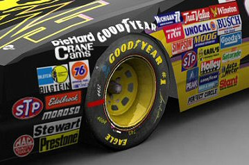
Why do people want their blogs to look like NASCAR vehicles?

Closeup of advertising decals on NASCAR vehicle

Blogs work because they're simple. Adding a bunch of flair just makes them harder to navigate and more difficult to read.

Take Tom Sherman's blog, for example. Great content. But navigating his blog is painful:

  1. I have to click "continue reading" to see the rest of the entry. Why? Are we afraid the main page is going to grow too long and break my scroll bar?
  2. The "websites I've linked to" and "websites I've cited" sections at the bottom aren't particularly helpful. And they obscure the links to browse more entries, which is the most natural thing to do at the bottom of a page, assuming the reader gets that far.
  3. I can only view 15 more entries, then I'm shunted to the monthly archives.
  4. While viewing the monthly archives, I couldn't figure out how to see more than one page.

I'd love to browse the rest of Tom's entries, but he's made it awfully difficult for me to do so.

And then there's Scott Mitchell's blog. Scott's a fantastic writer with a long history in ASP and ASP.NET. But do we really need to see those daily comment statistics and hourly hit statistics along the right side of the page? I'm sure Scott finds them interesting, but they're just noise to me.

Perhaps this is really an argument in favor of RSS-- all of the content with none of the excess flair.

Related posts

Because Reading is Fundamental

Because Reading is Fundamental

Most discussions show a bit of information next to each user: What message does this send? * The only number you can control printed next to your name is post count. * Everyone who reads this will see your current post count. * The more you post, the bigger that number next to

By Jeff Atwood ·
Comments

The “Just In Time” Theory of User Behavior

I’ve long believed that the design of your software has a profound impact on how users behave within your software. But there are two sides to this story: * Encouraging the “right” things by making those things intentionally easy to do. * Discouraging the “wrong” things by making those things intentionally

By Jeff Atwood ·
Comments

For a Bit of Colored Ribbon

For the last year or so, I've been getting these two page energy assessment reports in the mail from Pacific Gas & Electric, our California utility company, comparing our household's energy use to those of the houses around us. Here's the relevant excerpts from

By Jeff Atwood ·
Comments

Are You a Digital Sharecropper?

Will Work for Praise: The Web's Free-Labor Economy [https://www.bloomberg.com/news/articles/2008-12-28/will-work-for-praise-the-webs-free-labor-economybusinessweek-business-news-stock-market-and-financial-advice] describes how many of today's websites are built by the users themselves: > It's dawn at a Los Angeles apartment overlooking the Hollywood Hills. Laura Sweet, an advertising

By Jeff Atwood ·
Comments

Recent Posts

Stay Gold, America

Stay Gold, America

We are at an unprecedented point in American history, and I'm concerned we may lose sight of the American Dream.

By Jeff Atwood ·
Comments
The Great Filter Comes For Us All

The Great Filter Comes For Us All

With a 13 billion year head start on evolution, why haven’t any other forms of life in the universe contacted us by now? (Arrival is a fantastic movie. Watch it, but don’t stop there – read the Story of Your Life novella it was based on for so much

By Jeff Atwood ·
Comments
I Fight For The Users

I Fight For The Users

If you haven’t been able to keep up with my blistering pace of one blog post per year, I don’t blame you. There’s a lot going on right now. It’s a busy time. But let’s pause and take a moment to celebrate that Elon Musk

By Jeff Atwood ·
Comments
The 2030 Self-Driving Car Bet

The 2030 Self-Driving Car Bet

It’s my honor to announce that John Carmack and I have initiated a friendly bet of $10,000* to the 501(c)(3) charity of the winner’s choice: By January 1st, 2030, completely autonomous self-driving cars meeting SAE J3016 level 5 will be commercially available for passenger use

By Jeff Atwood ·
Comments