Conventions and Usability
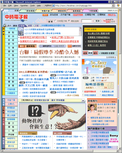
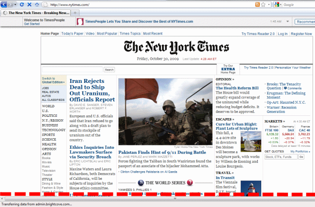
Philipp Lenssen recently conducted an interesting experiment in usability minimalism where he visually deleted all the unused elements from the web pages he visits every day.

Viewing some of Philipp’s native German web pages, I was reminded how powerful conventions can be; the page layout and formatting are strong cues for the content, even if I can’t read a word of it. This is something that Krug emphasizes in Don’t Make Me Think:

Faced with the prospect of using a convention, there’s a great temptation for designers to reinvent the wheel instead, largely because they feel (not incorrectly) that they’ve been hired to do something new and different, and not the same old thing. Not to mention the fact that praise from peers, awards, and high profile job offers are rarely based on criteria like “best use of conventions.”

Sometimes time spent reinventing the wheel results in a revolutionary new rolling device. But sometimes it just amounts to time spent reinventing the wheel.

If you’re not going to use an existing web convention, you need to be sure that what you’re replacing it with is either (a) is so clear and explanatory that there’s no learning curve– so it’s as as good as a convention; or (b) adds so much value that it’s worth a learning curve. If you’re going to innovate, you have to understand just how much value conventions add.

My recommendation: innovate when you know you have a better idea (and everyone you show it to says “Wow!”), but take advantage of conventions when you don’t.

This is also a good case for the never design what you can steal development ethos.

Related posts

Usability On The Cheap and Easy

Writing code? That's the easy part. Getting your application in the hands of users [https://blog.codinghorror.com/shipping-isnt-enough/], and creating applications that people actually want to use [https://blog.codinghorror.com/youll-never-have-enough-cheese/] — now that's the hard stuff. I've been a long time fan

By Jeff Atwood ·
Comments

The Opposite of Fitts' Law

If you've ever wrangled a user interface, you've probably heard of Fitts' Law. It's pretty simple – the larger an item is, and the closer it is to your cursor, the easier it is to click on. Kevin Hale put together a great visual

By Jeff Atwood ·
Comments

Revisiting "The Fold"

After I posted my blog entry on Treating User Myopia I got a lot of advice. Some useful, some not so useful. But the one bit of advice I hadn't anticipated was that we were not making good use of the area "above the fold". This

By Jeff Atwood ·
Comments

Treating User Myopia

I try not to talk too much about the trilogy here, because there's a whole other blog for that stuff. But some of the lessons I've learned in the last year while working on them really put into bold relief some of my earlier blog entries

By Jeff Atwood ·
Comments

Recent Posts

Let's Talk About The American Dream

Let's Talk About The American Dream

A few months ago I wrote about what it means to stay gold — to hold on to the best parts of ourselves, our communities, and the American Dream itself. But staying gold isn’t passive. It takes work. It takes action. It takes hard conversations that ask us to confront

By Jeff Atwood ·
Comments
Stay Gold, America

Stay Gold, America

We are at an unprecedented point in American history, and I'm concerned we may lose sight of the American Dream.

By Jeff Atwood ·
Comments
The Great Filter Comes For Us All

The Great Filter Comes For Us All

With a 13 billion year head start on evolution, why haven’t any other forms of life in the universe contacted us by now? (Arrival is a fantastic movie. Watch it, but don’t stop there – read the Story of Your Life novella it was based on for so much

By Jeff Atwood ·
Comments
I’m feeling unlucky... 🎲   See All Posts