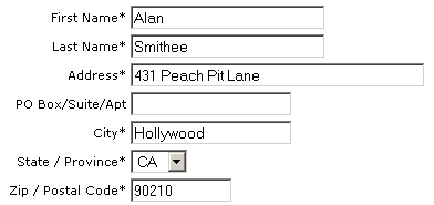
Web Forms: Death By a Thousand Textboxes
Why do HTML forms have to be death by a thousand tiny textboxes?
The classic example of this is phone number, which typically forces you to tab through three annoying little textboxes to enter a single number.
Why can’t we let the user enter the number however they like, and accept lots of formats?
Yes, it’s a bit more work for the programmer. But who cares? The developers will only code and debug this once. Users, however, will be forced to enter thousands of telephone numbers in that tedious, time-consuming tiny textbox way. Forcing hundreds of users to do more work to make a single programmer’s life slightly easier is a false economy.
I also wonder why we have to enter addresses in a bunch of textboxes.

Wouldn’t it be easier if I just filled out a mailing label and typed my address exactly the same way I write it?

Everyone has filled out an address label before. It’s completely and utterly intuitive, even if you live in another country.
I realize this doesn’t work for the entire order form. We still need to collect email address, phone numbers, and so forth. But it sure would make the address entry a lot easier – and more obvious – for the users.
We have to stop optimizing for programmers and start optimizing for users.


