Fitts' Law is arguably the most important formula in the field of human-computer interaction. It's..
Time = a + b log2 ( D / S + 1 )
.. where D is the distance from the starting point of the cursor, and S is the width of the target. This is all considered on a 2D plane relative to the axis of movement.

Years of experimental results have proven Fitts' law time and time again:
Fitts' law has been shown to apply under a variety of conditions, with many different limbs (hands, feet, head-mounted sights, eye gaze), manipulanda (input devices), physical environments (including underwater!), and user populations (young, old, mentally retarded, and drugged participants). Note that the constants a and b have different values under each of these conditions.
It's not exactly rocket science, as Bruce Tognazzini points out:
The time to acquire a target is a function of the distance to and size of the target.
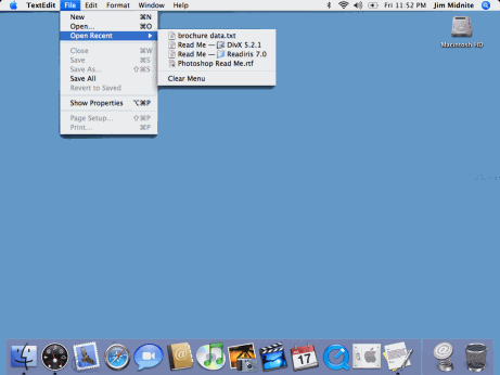
While at first glance, this law might seem patently obvious, it is one of the most ignored principles in design. Fitts' law (properly, but rarely, spelled "Fitts' Law") dictates the Macintosh pull-down menu acquisition should be approximately five times faster than Windows menu acquisition, and this is proven out.
So, to make navigation easier, you either put clickable items closer together, or you make the clickable area bigger. Or both. I know what you're thinking: no duh. But bear with me.
Here's one thing that puzzled me. I hate Windows as much as the next disestablishmentarianist, but how can the menu argument be valid? Are Macintosh pull-down menus really that much larger than Windows pull-down menus?

They aren't significantly larger. But Macintosh menus aren't attached to the application window-- they're always at the top of the screen.

Since the cursor stops at the edge of the screen, for the purposes of Fitts' law calculation, Macintosh menus are infinitely tall! Thus, Macintosh menus are faster to navigate.
Although placing the menus at the top of the display does leverage Fitts' law nicely, it also presents its own set of problems.
- Where does the menu go in a multiple monitor scenario? I use three monitors on both my home and work PCs. If I move an application to the rightmost monitor, do the application menus still appear on the center or left monitor?
- Detaching applications from their UI in this manner seems to violate the rule of proximity-- related things should be together. On a single monitor system, the distance between the application and its menu could be quite large unless the application window is maximized.
- In a broader sense, I think the days of the main menu are numbered as a keystone GUI metaphor. As far back as I can remember, the Macintosh has always used this "menu at the top of the display" metaphor, so it's written in stone for users at this point. Change could be painful. But then again, Apple has a habit of reinventing themselves periodically, so who knows.
Fitts' law isn't just about making things larger and easier to click on. It's about maximizing the utility of the natural borders on the edges of your screen:
Fitts' law indicates that the most quickly accessed targets on any computer display are the four corners of the screen, because of their pinning action, and yet, for years, they seemed to be avoided at all costs by designers.
Use the pinning actions of the sides, bottom, top, and corners of your display: A single-row toolbar with tool icons that "bleed" into the edges of the display will be many times faster than a double row of icons with a carefully-applied one-pixel non-clickable edge between the tools and the side of the display.
I've definitely felt the pain of Fitts' law violations.
I love multiple monitors. In my opinion, life begins with two displays, the largest you can afford. And you should really upsize to three if you want maximum benefit. But one unfortunate side-effect of multiple monitors is the removal of some natural edges between adjoining monitors. The cursor now flows freely between monitors; it's painful to stop the cursor on the left and right edges of the app on the center monitor.
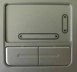
And Fitts' law violations can also extend to hardware. Consider touchpad designs that have dedicated scrolling areas on the left or bottom.

This seems like a good idea on paper, but in practice, it destroys the usability of the touchpad. On a touchpad with dedicated scrolling areas, you have no way to know when you've passed from touchpad area into the no-man's-land of scrolling area. The natural edges of the touchpad are ruined; we've given them an arbitrarily different, hard-coded set of functionality. Dedicated hardware isn't even necessary to achieve scrolling effects on a touchpad. We can easily leverage Fitts' Law in the touchpad driver software instead. Just slide your finger until you hit an edge, then slide it along the edge.
The edges could be your most valuable real estate. Use them responsibly. Fitts' law is powerful stuff.
Discussion
