Coding Horror

programming and human factors

It's a Malformed World

Bill de hra recently highlighted a little experiment Ian Hickson ran in August:

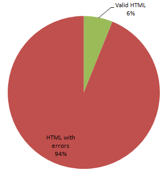
I did a short study recently checking only for syntax errors in HTML documents, and the results were that of the 667416 files tested, 626575 had syntax errors. Over 93%. That's only syntax errors in the HTML, not checking the CSS, the content types, the semantic errors (e.g. duplicate IDs -- 86461 of those files had duplicated IDs), or any other errors.

html-validation-pie-chart.png

If you included those kinds of errors, you'd probably find that almost all pages had errors that would trigger this warning. Thus any sort of visible UI would be basically always saying "this page is broken". That would not be good UI for the majority of users, who don't care.

Even Tim-Berners Lee, the godfather of the Web, acknowledges that the move to enforce well-formedness on the web with XHTML has failed:

Some things are clearer with hindsight of several years. It is necessary to evolve HTML incrementally. The attempt to get the world to switch to XML, including quotes around attribute values and slashes in empty tags and namespaces all at once didn't work. The large HTML-generating public did not move, largely because the browsers didn't complain. Some large communities did shift and are enjoying the fruits of well-formed systems, but not all. It is important to maintain HTML incrementally, as well as continuing a transition to well-formed world, and developing more power in that world.

Perhaps this is why there's 63 HTML validation errors on Google's homepage right now. Like it or not, we live in a world of malformed HTML. Browsers aren't compilers. They don't fail spectacularly when they encounter invalid markup. And nor should they. HTML is, and always has been, tolerant by design. We'll always be awash in a sea of tag soup.

Your browser doesn't care if your HTML is well-formed. Your users don't care if your HTML is well-formed. So why should you?

Discussion

Office 2007 -- not so WIMPy

In my opinion, the new Office 2007 user interface is one of the most innovative things to come out of Redmond in years. It's nothing less than the death of the main menu as a keystone GUI metaphor. This is a big deal. Historically, where Office goes, everyone else follows. It's already starting to trickle down: IE7 does not show its main menu by default, and neither does Vista. You have to press Alt to expose the menu. The main menu has been demoted to a sort of configuration panel for advanced users; for everyone else, there's the Ribbon and toolbar buttons.

GUIs are characterized by their WIMP characteristics: Windows, Icons, Menus, Pointing device. Office 2007's Ribbon is a compelling argument in favor of abandoning the creaky old main menu GUI metaphor. I'd also argue that Office, in every new version, has further de-emphasized the highly problematic MDI windowing standard. Even without the vagaries of MDI, I spend far more time wrangling windows than I should. That's why I work with maximized windows 99% of the time (albeit across multiple monitors). So I'm inclined to think that windows themselves aren't all that useful as a GUI construct either, either. So, if Office 2007 drops the W and M from WIMP, what are we left with?

IP. Icons and Pointing Devices.

It's a radical change, right? Perhaps, until you consider the world's most popular GUI environment, the web browser, has no Menus or Windows. It's nothing but Icons and Pointing Devices. And yet people seem to adapt to the web much more readily than traditional WIMP apps. If anything, Office 2007's UI overhaul brings it in line with the rest of world that lives in your web browser.

Still, it's impressive that Microsoft was willing to make such a large change to their flagship application. Vista, in comparison, makes almost no changes to the core Windows GUI. Jensen Harris' blog documents exactly how Microsoft arrived here:

There are dozens of related articles in Jensen's Office 2007 UI bible, but these background articles are essential.

Kudos to Microsoft on the UI changes in Office 2007. It's the first version of Office worth upgrading to.

Discussion

Speed Still Matters

I remember switching my homepage from AltaVista to Google back in 2000 for one simple reason: it was blazingly fast. It's the same reason I don't use personalized Google, or Google suggest as my homepage: they're simply too slow.

Dare Obasanjo* wonders if AJAX apps are rolling page load speeds back six years:

One big problem with the AJAX craze that has hit the Web is how much slower websites have become now that using Flash and DHTML to add "richness" to Web applications is becoming more commonplace. My mind now boggles at the fact that I now see loading pages that last several seconds when visiting Web sites more and more these days.

Dare uses Yahoo! Mail as an example, but I've experienced similarly long load times for the new Hotmail beta, too. The load times can be so long that a combination disclaimer/escape hatch appears below the loading animation:

windows live mail loading disclaimer

Maybe I'm just impatient. However, there's a lot of concrete data to support the theory that unless you make it load fast, nobody will stick around long enough to find out what you have to offer. For instance, a recent study found that most shoppers will only wait four seconds for a page to load before abandoning the site entirely.

Dare also cited this post by Greg Linden which provides more quantitative data on page load times from Google and Amazon:

Google VP Marissa Mayer just spoke at the Web 2.0 Conference and offered tidbits on what Google has learned about speed, the user experience, and user satisfaction.

Marissa started with a story about a user test they did. They asked a group of Google searchers how many search results they wanted to see. Users asked for more, more than the ten results Google normally shows. More is more, they said. So Marissa ran an experiment where Google increased the number of search results to thirty. Traffic and revenue from Google searchers in the experimental group dropped by 20%.

Ouch. Why? Why, when users had asked for this, did they seem to hate it?

After a bit of looking, Marissa explained that they found an uncontrolled variable. The page with 10 results took .4 seconds to generate. The page with 30 results took .9 seconds. Half a second delay caused a 20% drop in traffic. Half a second delay killed user satisfaction.

This conclusion may be surprising -- people notice a half second delay? -- but we had a similar experience at Amazon.com. In A/B tests, we tried delaying the page in increments of 100 milliseconds and found that even very small delays would result in substantial and costly drops in revenue.

And let's not forget the classic reference on application responsiveness: Response Time in Man-Computer Conversation Transactions, written way back in 1968 by R.B. Miller. I know it primarily through Jakob Neilsen's Response Times: The Three Important Limits.

  • 0.1 second is about the limit for having the user feel that the system is reacting instantaneously, meaning that no special feedback is necessary except to display the result.

  • 1.0 second is about the limit for the user's flow of thought to stay uninterrupted, even though the user will notice the delay. Normally, no special feedback is necessary during delays of more than 0.1 but less than 1.0 second, but the user does lose the feeling of operating directly on the data.

  • 10 seconds is about the limit for keeping the user's attention focused on the dialogue. For longer delays, users will want to perform other tasks while waiting for the computer to finish, so they should be given feedback indicating when the computer expects to be done. Feedback during the delay is especially important if the response time is likely to be highly variable, since users will then not know what to expect.

The 10 second number seems too high for today's world of ubiquitous broadband and quad-core CPUs. That level of delay should be increasingly rare. I'd argue the user attention threshold is now more like 5 seconds. If your application is going to spend more than 5 seconds doing something, you owe your users an estimate of when you'll be done, and real-time feedback on your progress. A basic hourglass doesn't cut it.

What's more important? Getting flash after 5 seconds, or functional no-frills layouts in less than a second? Let's get our priorities straight. Speed still matters. And remember, the perception of speed is just as important as actual speed. If you can't be fast, be clever. Exploit progressive rendering and HTTP compression.

* It's ironic, then, that Dare's blog is so incredibly slow to load every time I've directly visited it. One benefit of RSS aggregators, I suppose, is that I rarely need to.

Discussion
Screencasting for Windows

If a picture is worth a thousand words, is a single screencast equal to a thousand word blog post?

There's a lot to be said for lightweight, embedded screencasts. I'm particularly fond of animated GIF screencasts for small demonstrations. You can see examples in these posts: one, two, three.

Here's a compendium of all the screencasting tools I could find, but it's far from comprehensive:

You're also probably wondering which of these tools I recommend. What do I look like, Scott Hanselman? I've only used three of these, not all of them. Check out Donation Coder's screencasting roundup for a blow by blow comparison.

Personally, I use GifgIfgiF for quick and dirty animated GIF screencasts, and Camtasia studio for more advanced screencasts where I may need to do editing or render to output formats such as Flash, Quicktime, or Windows Media. One of the biggest challenges in screencasting is choosing an appropriate codec. Video codecs are optimized for movie content, definitely not for GUIs. Screencast results can be quite poor if you choose a typical movie codec. Did you know Windows Media Player has an outstanding screen codec that's optimized for GUIs?

I recommend picking up one of the free screencasting tools to start with. Add it to your toolkit. Get comfortable with how it works so you can whip out a screen capture session any time the situation calls for it. However, if you find yourself doing a lot of screencasting, I'd definitely invest in one of the more expensive tools that offers more editing options and more choices in output rendering.

Discussion

KeyTraino for Visual Studio 2005

Leon Bambrick is full of good ideas. Like KeyTraino, for instance:

When you use the toolbar, the menus or the context-menus of an application, KeyTraino shows the alternative keystroke you could've used.

Evidently someone at SlickEdit is wearing a tinfoil hat that transmits at the same frequency as Leon's, because they just released a free set of Visual Studio 2005 add-ins that includes the KeyTraino feature:

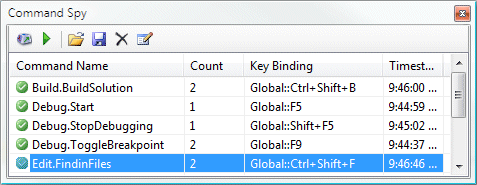
The Command Spy monitors command execution and allows you to see exactly what commands you've run, how many times you've run them and what key bindings are used to invoke those commands. The main purpose of this tool is to allow you to learn what commands are bound to which keystrokes, so that you can work faster within the IDE.

And it works, too:

slickedit-command-spy.png

This very same add-in has a bunch of other features, too. It allows you to place the dancing banana (or any other graphic of your choice) in the editor pane of your IDE. No, I'm not kidding.

The Dancing Banana

Now that's productivity.

Discussion