Coding Horror

programming and human factors

The Power of Defaults

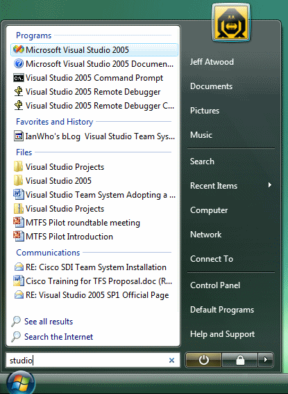
In Typing Trumps Pointing, I extolled the virtues of the full-text search included in Vista's new Start Menu. As many commenters pointed out, the feature itself is nothing new:

I love keyboard searching, but basically you say you are installing Vista, an entire operating system, just so you don't have to install Colibri, SlickRun, Launchy, or one of the many other similar and fully functional tools that give similar results for 10% cost and 1% hassle.

It's true. There are dozens of third-party solutions that deliver very similar interactive full-text search UI experiences. But there's one key difference between those solutions and the one in Vista: I have to install them. You may argue that, in the near term, I also have to install Vista. Fair enough. But over the next five years, millions of users will buy computers with Vista pre-installed. And they'll immediately benefit from the built-in, default full-text search UI that's accessible right out of the box with a single press of the Windows key.

There's nothing to install. There's nothing to configure. It just works.

That's the power of defaults.

Defaults are arguably the most important design decisions you'll ever make as a software developer. Choose good defaults, and users will sing the praises of your software and how easy it is to use. Choose poor defaults, and you'll face down user angst over configuration, and probably a host of tech support calls as well.

Furthermore, once a default becomes a well-accepted standard, it's an expectation. Other vendors will be peer pressured into at least matching that default. And to truly succeed, they'll have to come up with an even better default. Defaults are how the software industry evolves. It also highlights a problem with the Linux and Unix models; because they're infinitely configurable, it's impossible to tell what you're comparing the next version of the software with. There's no baseline, no standard, only the giant cop-out of endless user configuration.

Defaults aren't just important to software developers; they're incredibly important to UI designers, too. Jakob Nielsen elaborates:

Users rely on defaults in many other areas of user interface design. For example, they rarely utilize fancy customization features, making it important to optimize the default user experience, since that's what most users stick to.

In forms and applications, pre-populate fields with the most common value if you can determine it in advance. For example, on the registration form for my usability conference, if people register for an event in Boston, the country field will say "United States" by default, but if they register for London, it will say "United Kingdom." Obviously, many people come from other countries, and they'll have to change this entry to specify their own country -- but they'd have to specify it anyway if we'd left it blank. By choosing the most common country as the default, we save many users that bit of work.

Defaults make two essential contributions to usability:

  • By showing a representative value, they serve as just-in-time instructions to help users understand how to complete a field.
  • By showing a frequent value, they help users understand the commonly expected response, as opposed to more atypical ones. You can use this knowledge for sales purposes -- for example, by pre-selecting the one-year option in a subscription interface that also offers monthly payments. But, if you consistently pick the most expensive option as the default, you'll lose credibility, so don't overdo it.

By educating and guiding users, default values help reduce errors. It's therefore important to select helpful defaults, rather than those based on the first letter of the alphabet or whatever the first option on your original list happened to be.

Defaults can also affect your company's bottom line. That's why Google, Microsoft, and Yahoo are willing to pay millions of dollars to influence the defaults on a user's desktop.

For most users, the default value is the only value. Your choice of default values will have a profound impact on how your application is used. You should agonize over every default in your software. If you aren't, you're doing the user, and yourself, a disservice.

Discussion

Typing Trumps Pointing

Windows Vista gets criticized a lot in the press, mostly for not being OS X. Some of the criticisms are valid. It is terribly late. And the feature list has grown less and less impressive as the development process has worn on over the years.

But Vista has one killer feature up its sleeve. A feature that, as far as I'm concerned, makes it a must-have upgrade on day one of availability. Vista's Start Menu lets you type what you want instead of pointing at it. Here's what happens when I press the Windows key, then type "studio".

Windows Vista start menu text search

As I type, Vista's start menu displays real time, full-text search matches across multiple locations: the start menu, my user folder, my favorites and browser history, my email history, and so on.

I had ways of doing this in Windows XP, but with Vista, typing to navigate is now quite literally the cornerstone of the operating system. I've gone from tedious, manually defined hotkeys and shortcuts in Windows XP to simply typing what I want and letting the computer find it for me. It also utterly obsoletes the Start, Run (or Windows+R) menu because it works for file paths, too:

Windows Vista start menu path search

Best of all, I never have to take my hand off the keyboard. The first match is always selected; I can press Enter to launch it immediately. Alternately, I could use the up and down arrows to highlight the item I want, and press Enter to launch that. Or I could continue typing to further refine my match in real time.

The start menu has been a usability trainwreck since its introduction in 1995. I had no idea Microsoft would so completely and thoroughly reinvent the Start Menu in Vista. It has completely changed the way I work with my computer. And it's standard out of the box. There's nothing to install, nothing to configure, nothing to think about. It just works. Like so:

  • To launch Notepad
    Windows key, type "not", then Enter.
  • To set my Mouse options
    Windows key, type "mou", then Enter.
  • To launch Word
    Windows key, type "word", down arrow, then Enter. (unfortunately, WordPad is still the first match).
  • To navigate to my WinAmp folder
    Windows key, type "c:p", down arrow, type "w", down arrow, Enter.
  • To set the date and time
    Windows key, type "dat", then Enter.
  • To play Rainbow 6: Vegas
    Windows key, type "veg", then Enter.
  • To visit codinghorror.com
    Windows key, type "cod", then Enter.

This new all-in-one keyboard style of navigation is unbelievably, amazingly efficient. It is by far the single best new feature of Vista in my book. I cannot, I will not, go back to Windows XP, with its horrific mouse-centric cascading start menu, and the utilitarian but unhelpful Windows+R Start Run dialog.

Ironically, Microsoft's revamped Start Menu may be the final sign that we've fully entered the Google era of computing. As Bill de hra noted:

Perhaps the hunt and peck approach of searching is becoming the dominant computing metaphor, replacing nearly 3 decades of user interfaces based on the metaphor of an office desktop.

No more hunting for the right bunch of pixels to click; it's faster and easier to type to get to what you want instead. It's a tacit acknowledgement that Google was right all along. It's not quite a command line renaissance, but it is an implied victory of textual search over traditional point-and-click desktop GUI metaphors. Typing trumps pointing. There's far too much content in the world-- and even on your local computer-- for browsing and pointing to work reliably as a navigation scheme today. Keyboard, text and search are the new bedrock navigation schemes for the 21st century.

Discussion

Test Doubles: A Taxonomy of Pretend Objects

Ned recently pointed out Martin Fowler's article Mocks Aren't Stubs.

The vocabulary for talking about [pretend objects] soon gets messy - all sorts of words are used: stub, mock, fake, dummy. For this article I'm going to follow the vocabulary of Gerard Meszaros's upcoming book. It's not what everyone uses, but I think it's a good vocabulary and since it's my essay I get to pick which words to use. Meszaros uses the term Test Double as the generic term for any kind of pretend object used in place of a real object for testing purposes.

Personally, I like to think of them as Stunt Objects. Meszaros, via Fowler, defines the following taxonomy of pretend objects:

dummy.jpg

Dummy objects are passed around but never actually used. Usually they are just used to fill parameter lists.

fake.jpg

Fake objects actually have working implementations, but usually take some shortcut which makes them not suitable for production.

stubs.jpg

Stub objects provide canned answers to calls made during the test, usually not responding at all to anything outside what's programmed in for the test.

mock.jpg

Mock objects are pre-programmed with expectations which form a specification of the calls they are expected to receive.

Discussion

The Story About PING

Everyone loves ping. It's simple. It's utilitarian. And it does exactly what the sonar inspired name implies. Ping tells you if a remote computer is responding to network requests.

the PING command

The ping utility was written by Mike Muuss, a senior scientist at the U.S. Army Research Laboratory. Mike also wrote ttcp, which I'm a big fan of. I've used the PC port of ttcp many times to test network throughput.

Mike was tragically killed in an automobile accident 7 years ago, but his legacy lives on in Ping:

In December of 1983 I encountered some odd behavior of the IP network at BRL. Recalling Dr. Mills' comments, I quickly coded up the PING program, which revolved around opening an ICMP style SOCK_RAW AF_INET Berkeley-style socket(). The code compiled just fine, but it didn't work -- there was no kernel support for raw ICMP sockets! Incensed, I coded up the kernel support and had everything working well before sunrise. Not surprisingly, Chuck Kennedy (aka "Kermit") had found and fixed the network hardware before I was able to launch my very first "ping" packet. But I've used it a few times since then. If I'd known then that it would be my most famous accomplishment in life, I might have worked on it another day or two and added some more options.

Ping isn't very useful on today's internet because most routers and hosts filter it out. But it's still quite useful on local networks; not a month goes by that I'm not pinging something. Ping is always a solid starting point, but sometimes you'll need to perform deeper network diagnostics, too.

Of course, we can't talk about ping without mentioning one of the most famous Amazon book reviews of all time.

The Story About Ping PING! The magic duck!

Using deft allegory, the authors have provided an insightful and intuitive explanation of one of Unix's most venerable networking utilities. Even more stunning is that they were clearly working with a very early beta of the program, as their book first appeared in 1933, years (decades!) before the operating system and network infrastructure were finalized.

The book describes networking in terms even a child could understand, choosing to anthropomorphize the underlying packet structure. The ping packet is described as a duck, who, with other packets (more ducks), spends a certain period of time on the host machine (the wise-eyed boat). At the same time each day (I suspect this is scheduled under cron), the little packets (ducks) exit the host (boat) by way of a bridge (a bridge). From the bridge, the packets travel onto the internet (here embodied by the Yangtze River).

The title character -- er, packet, is called Ping. Ping meanders around the river before being received by another host (another boat). He spends a brief time on the other boat, but eventually returns to his original host machine (the wise-eyed boat) somewhat the worse for wear.

If you need a good, high-level overview of the ping utility, this is the book. I can't recommend it for most managers, as the technical aspects may be too overwhelming and the basic concepts too daunting.

As good as it is, The Story About Ping is not without its faults. There is no index, and though the ping(8) man pages cover the command line options well enough, some review of them seems to be in order. Likewise, in a book solely about Ping, I would have expected a more detailed overview of the ICMP packet structure.

But even with these problems, The Story About Ping has earned a place on my bookshelf, right between Stevens' Advanced Programming in the Unix Environment, and my dog-eared copy of Dante's seminal work on MS Windows, Inferno. Who can read that passage on the Windows API ("Obscure, profound it was, and nebulous, So that by fixing on its depths my sight -- Nothing whatever I discerned therein."), without shaking their head with deep understanding. But I digress.

It's a timeless geek humor classic. The original was posted in March 1999 by an anonymous reviewer from "Upper Volta, Uzbekistan". It must have been deleted by Amazon, because it was reinstated by another reviewer later in 2000.

You may be familiar with the command line version of Ping, and maybe even the book, but did you ever play the arcade version of Ping?

Ping, the arcade version

It's milliseconds of fun for the entire family.

Discussion

The Sugar UI

I've largely been ignoring Nicholas Negroponte's One Laptop Per Child initiative. I appreciate the nobility of the gesture, but how interesting can sub-$100 hardware running Linux really be? Well, that was before I read about the novel user interface they're building into those small green and white laptops.

For most of these children the XO machine, as it's called, likely will be the first computer they've ever used. Because the students have no expectations for what PCs should be like, the laptop's creators started from scratch in designing a user interface they figured would be intuitive for children.

The result is as unusual as -- but possibly even riskier than -- other much-debated aspects of the machine, such as its economics and distinctive hand-pulled mechanism for charging its battery. (XO has been known as the $100 laptop because of the ultra-low cost its creators eventually hope to achieve through mass production.)

For example, students who turn on the small green-and-white computers will be greeted by a basic home screen with a stick-figure icon at the center, surrounded by a white ring. The entire desktop has a black frame with more icons.

This runic setup signifies the student at the middle. The ring contains programs the student is running, which can be launched by clicking the appropriate icon in the black frame.

When the student opts to view the entire "neighborhood" -- the XO's preferred term instead of "desktop" -- other stick figures in different colors might appear on the screen. Those indicate schoolmates who are nearby, as detected by the computers' built-in wireless networking capability.

Sugar UI screenshot -- neighborhood

Moving the PC's cursor over the classmates' icons will pull up their names or photos. With further clicks the students can chat with each other or collaborate on things -- an art project, say, or a music program on the computer, which has built-in speakers.

I'm interested now.

I've been disappointed in the lack of GUI innovation over the last decade. Sure, Microsoft and Apple take small jabs at each other every couple of years. And the Linux community apes both companies, occasionally throwing in a curveball of their own. But when was the last time anyone tried a radically different UI on the desktop? The Sugar UI featured in the OLPC appears to finally break from the well worn conventions of Windows and MacOS.

I wanted to try it out myself. I downloaded the emulated OLPC laptop image and ran it under QEMU. The documentation even warns you to prepare yourself for this alien UI experience.

Before you launch the emulated image, we strongly recommend reading through the Sugar Instructions on how to use the environment -- this does not look like the Windows or Mac operating systems!

They weren't kidding. It's nothing like any traditional GUI.

Sugar UI screenshot -- browser

I was inclined to like Sugar almost immediately because it embodies a number of experimental GUI concepts I've talked about before:

Sugar UI development appears to lag quite a bit behind the challenging, sub-$100 design goal of the OLPC hardware itself. This doesn't surprise me, because developing UI is hard. And developing a radically different UI has to be especially difficult. Innovation and experimentation is much riskier than following the roadmaps from Redmond and Cupertino. That's why, despite the rough edges, I'm excited about Sugar.

The Sugar instructions offer an excellent basic overview of the UI, with many more screenshots. If you're a designer, check out the Sugar UI design guide. There's also a video walkthrough of the Sugar UI available.

I have to admit that I didn't find the Sugar UI particularly intuitive or discoverable, even after using it for 10 minutes and learning the basics. But I'm not a child. Maybe something unusual is necessary to get kids' creative juices flowing. Mr. Negroponte has strong feelings on this topic:

In fact, one of the saddest but most common conditions in elementary school computer labs (when they exist in the developing world), is the children are being trained to use Word, Excel and PowerPoint. I consider that criminal, because children should be making things, communicating, exploring, sharing, not running office automation tools.

He's got a point. I don't know many kids that want to grow up to be "Information Workers".

Discussion