Coding Horror

programming and human factors

Code Access Security and Bitfrost

The One Laptop Per Child operating system features a new security model-- Bitfrost. It's an interesting departure from the traditional UNIX and LINUX security model.

The 1971 version of UNIX supported the following security permissions on user files:

  • non-owner can change file (write)
  • non-owner can read file
  • owner can change file (write)
  • owner can read file
  • file can be executed
  • file is set-uid

These permissions should look familiar, because they are very close to the same security permissions a user can set for her files today, in her operating system of choice. What's deeply troubling -- almost unbelievable -- about these permissions is that they've remained virtually the only real control mechanism that a user has over her personal documents today: a user can choose to protect her files from other people on the system, but has no control whatsoever over what her own programs are able to do with her files.

In 1971, this might have been acceptable: it was 20 years before the advent of the Web, and the threat model for most computer users was entirely different than the one that applies today. But how, then, is it a surprise that we can't stop viruses and malware now, when our defenses have remained largely unchanged from thirty-five years ago?

BitFrost intends to address this problem by adding a new level of permissions that applies to code, not users: code access security.

Consider the Solitaire game shipped with most versions of Microsoft Windows. This program needs:

  • no network access whatsoever
  • no ability to read the user's documents
  • no ability to utilize the built-in camera or microphone
  • no ability to look at, or modify, other programs

Yet if somehow compromised by an attacker, Solitaire is free to do whatever the attacker wishes, including:

  • read, corrupt or delete the user's documents, spreadsheets, music, photos and any other files
  • eavesdrop on the user via the camera or microphone
  • replace the user's wallpaper
  • access the user's website passwords
  • infect other programs on the hard drive with a virus
  • download files to the user's machine
  • receive or send e-mail on behalf of the user
  • play loud or embarassing sounds on the speakers

The critical observation here is not that Solitaire should never have the ability to do any of the above (which it clearly shouldn't), but that its creators know it should never do any of the above. If the system implemented a facility for Solitaire to indicate this at installation time, Solitaire could irreversibly shed various privileges the moment it's installed. This severely limits or destroys its usefulness to an attacker were it taken over.

If I sound skeptical, that's because BitFrost sounds suspiciously similar to .NET framework code access security, as outlined in the System.Security.Permissions namespace. It's an enormous, complex list of explicit permissions you can grant or deny in your application's install manifest, exactly as described in the Solitaire example above. It sounds great in theory: establish a limited set of permissions your application needs up front, and let the .NET runtime worry about enforcing those permissions while your application is running.

But in practice, very few .NET developers make use of code access security. It appears Microsoft noticed that, too:

It seems Microsoft does not understand why nobody uses Code Access Security. In fact, Microsoft has a survey on the Internet. You can go ahead and answer the survey but if you have followed this entry, you should know what I am getting at: Code Access Security is too hard. Don't get me wrong, I think Code Access Security is great. In particular, the stack walk mechanism is terrific. But the policy side is way too hard for most people.

The CAS model was so profoundly unsuccessful in .NET 1.0 and 1.1 that ClickOnce in .NET 2.0 effectively does away with CAS. You're now exactly one click away from running a full trust application that can do whatever it wants to on your machine, with no restrictions of any kind.

Perhaps the OLPC's BitFrost model will fare better than .NET Code Access Security did. But somehow I doubt it. What good is a security model that's so cumbersome to use, nobody ever adopts it?

Discussion

Primary Keys: IDs versus GUIDs

Long-time readers of this blog know that I have an inordinate fondness for GUIDs. Each globally unique ID is like a beautiful snowflake: every one a unique item waiting to be born.

Perhaps that's why I read with great interest recent accounts of people switching their database tables from traditional integer primary keys ...

ID  Value
--  -----
1   Apple
2   Orange
3   Pear
4   Mango

.. to GUID keys.

ID                                    Value
------------------------------------  -----
C87FC84A-EE47-47EE-842C-29E969AC5131  Apple
2A734AE4-E0EF-4D77-9F84-51A8365AC5A0  Orange
70E2E8DE-500E-4630-B3CB-166131D35C21  Pear
15ED815C-921C-4011-8667-7158982951EA  Mango

I know what you're thinking. Using sixteen bytes instead of four bytes for a primary key? Have you lost your mind? Those additional 12 bytes do come at a cost. But that cost may not be as great as you think:

Using a GUID as a row identity value feels more natural-- and certainly more truly unique-- than a 32-bit integer. Database guru Joe Celko seems to agree. GUID primary keys are a natural fit for many development scenarios, such as replication, or when you need to generate primary keys outside the database. But it's still a question of balancing the tradeoffs between traditional 4-byte integer IDs and 16-byte GUIDs:

GUID Pros
  • Unique across every table, every database, every server
  • Allows easy merging of records from different databases
  • Allows easy distribution of databases across multiple servers
  • You can generate IDs anywhere, instead of having to roundtrip to the database
  • Most replication scenarios require GUID columns anyway
  • GUID Cons
  • It is a whopping 4 times larger than the traditional 4-byte index value; this can have serious performance and storage implications if you're not careful
  • Cumbersome to debug where userid='{BAE7DF4-DDF-3RG-5TY3E3RF456AS10}'
  • The generated GUIDs should be partially sequential for best performance (eg, newsequentialid() on SQL 2005) and to enable use of clustered indexes
  • I'm not proposing that every database switch to GUID primary keys, but I do think it's important to know the option is out there. If you're still on the fence, what should I choose for my primary key? has excellent advice and a solid analysis of the tradeoffs.

    Discussion

    Creating User Friendly 404 Pages

    We understand what 404 means: Page Not Found. But the average internet user has no idea what 404 means or what to do about it. To them, it's yet another unintelligible error message from the computer. Most 404 pages are unvarnished geek-speak. Consider the default 404 page under IIS:
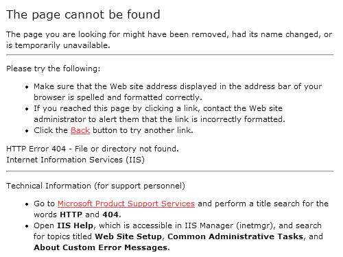
    default 404 page from Microsoft Internet Information Server (IIS) webserver

    The default 404 page under Apache is no better:

    default 404 from Apache webserver

    Internet Explorer tries to shield the user from these poorly constructed 404 pages by automatically substituting friendlier error messages:

    Friendly 404 page from Internet Explorer 7

    It's not bad. It's certainly an improvement over the default 404 from Apache or IIS. But we can do better.

    We can stop relying on the default behavior of our webservers and web browsers, and create our own custom 404 page. Unfortunately, many sites have custom 404 pages that are barely discernable from the generic webserver defaults. You wonder why they bother.

    custom 404 page from Google

    So, what exactly should a user-friendly custom 404 page do? Although there's an entire website dedicated to documenting funny 404 pages, funny isn't necessarily helpful. What can we do to help the user at this point? I have some ideas.

    1. Drop the 404

      Yes, the HTTP response code is 404, but there's absolutely no reason that ever needs to be shown on the actual page. Error codes aren't helpful. A simple explanation of the problem in plain English is all that's required. Any 404 page that has the characters "404" on it, if not already an outright failure, is already well on its way to becoming one.

    2. Automatically notify you of the 404

      Repeat after me: it is not the user's job to inform you about problems with your website. If you require the user to click a button to notify you about a 404, or if you require the user to fill out a broken link form, you have utterly failed your users. 404 notification should be automatic, and by that I do not mean "sit in my log files until I eventually have time to look for it". I suggest weekly or monthly 404 rollup reports, emailed automatically to the powers that be. I'd also recommend real-time email notification if there is a sudden spate of 404s, so you have an opportunity to fix the problem while it's still relevant-- before the world gives up on your seemingly nonexistent page.

    3. Try to find what the user was looking for and provide links to possible matches

      Don't just put a search box on the 404 page and force the user to perform a search. That's a cop-out. Instead, automatically perform a search on their behalf, using the erroneous URL as the search input, and display those results on the 404 page. You can also try to correct the URL, based on rules derived from the top ten or top fifty observed 404 errors. Does the URL end in .htm instead of .html? Is it spelled wrong? Are your URLs case-sensitive? Was the page moved, renamed, or reorganized somewhere else? It's sensible to have a search box on your 404 page for convenience's sake, but forcing the user to perform a search should always be the method of last resort.

    4. Present links to the most popular or most recent items

      If someone is visiting your website, statistically speaking, there's a good chance they are coming to see the same attraction everyone else is. Even if they aren't, your popular content is popular for a reason. Why not present links to your "greatest hits" on the 404 page? Similarly, if you run a periodic website like a blog, or a newspaper, display the last few articles or entries on the 404 page. And at the very least, you'll want a link back to the main website. Provide a filtered list of relevant links, and an errant user will never be more than one click away from escaping their current predicament.

    5. Keep the 404 page simple

      Your 404 page should be brief, concise, and to the point.* You're already dealing with confused users who can't find what they're looking for. Don't add insult to injury by spamming the user with a giant, complicated 404 page containing a complete sitemap of your website. For example, the apple.com 404 page makes this mistake.

    I found that Jakob Nielsen, A List Apart, and 404 Research Lab also had good advice on making 404 pages potentially user friendly instead of the geeky, incomprehensible dead end signs they usually are.

    Dead End sign

    Unfortunately, I haven't had time to implement a better 404 page on my own website. Yet. If you're looking for live examples of 404 pages that get this right, I can recommend the 1976 design 404 page, as well as the useit.com 404 page. Sadly, this is an extremely short list because so few websites meet the criteria I outlined above. I sampled 404 pages from dozens of websites and most fail spectacularly, serving up 404 pages that are downright user hostile.

    Whichever route you choose, never settle for the default 404 page. Replace it with a custom 404 page that is polite, illuminating, and most of all, helpful.

    * But not too brief. You have to make your customized 404 page larger than 512 bytes, otherwise IE will assume it's a standard web server 404 message and replace it with its own friendly-ized version.

    Discussion
    The "Works on My Machine" Certification Program

    Joseph Cooney had a brilliant idea for a new application certification program. But Vista's bland white-on-gray badge, in my opinion, doesn't properly communicate the.. authoritative.. nature of said program. With the help of Jon Galloway, we zazzed things up a bit:

    works on my machine, starburst  

    You might think attaining such a prestigious, rigorous level of certification would be far too challenging. But fear not! Participating in this innovative new application certification program is as simple as pressing the F5 key on your keyboard. Just follow the four easy steps Joseph outlined:

    1. Compile your application code. Getting the latest version of any recent code changes from other developers is purely optional and not a requirement for certification.
    2. Launch the application or website that has just been compiled.
    3. Cause one code path in the code you're checking in to be executed. The preferred way to do this is with ad-hoc manual testing of the simplest possible case for the feature in question. Omit this step if the code change was less than five lines, or if, in the developer's professional opinion, the code change could not possibly result in an error.
    4. Check the code changes into your version control system.

    Congratulations! You're fully certified. Brand your app with your shiny new Works on My Machine badge. You'll certainly want to show it off to your fellow team members and key stakeholders. But please-- do try to keep your ego in check. Not everyone is capable of such an epic commitment to quality in software engineering.

    (update: love the WOMM certification so much you want to proudly wear your certification for all to see? T-Shirts and stickers now available.)

    United States / Canada
    Buy Coding Horror shirts and merchandise at CafePress
    Buy Works on My Machine shirts, stickers and mugs

    Discussion

    Are Web Interfaces "Good Enough"?

    Torrent, my favorite BitTorrent client, now offers a web UI. See if you can spot the differences between the Web UI and the Windows UI:

    Torrent web UI

    Torrent Windows UI

    After spending about a year interacting with Torrent exclusively through Remote Desktop, I was pleasantly surprised to discover how good the web UI is. It aggressively exploits the latest Ajax techniques to replicate most of the rich GUI functionality of Torrent in a browser. But the web UI is still a pale shadow of the full-blown Windows UI. There are small but important details missing throughout, and part of the pleasure of using Torrent was luxuriating in its intense attention to detail, its wealth of well-designed data readouts. Using the web UI is like drinking watered-down beer. It doesn't satisfy.

    But does it matter? Despite my nitpicking, I can do everything I need to do remotely through the web UI.

    I do sometimes miss the fit and finish of the complete Windows UI. But if the only way to achieve full fidelity is to log in to the machine as a user via Remote Desktop, it's hardly worth the effort. Remote GUI technology has never caught on, either in Windows (RDP), in UNIX (X11), or even on the Mac (ARD). This approach has always felt like overkill, and it doesn't seem workable based on the historical evidence.

    But maybe "good enough", via the eccentric and often unreliable combination of DHTML, JavaScript, and HTML, is all we need. That's what Joel Spolsky thinks, anyway:

    So the Web user interface is about 80% there, and even without new web browsers we can probably get 95% there. This is Good Enough for most people and it's certainly good enough for developers, who have voted to develop almost every significant new application as a web application.

    I'm actually a little bit sad about this, myself. To me the Web is great but Web-based applications with their sucky, high-latency, inconsistent user interfaces are a huge step backwards in daily usability. I love my rich client applications and would go nuts if I had to use web versions of the applications I use daily: Visual Studio, CityDesk, Outlook, Corel PhotoPaint, QuickBooks. But that's what developers are going to give us. Nobody (by which, again, I mean "fewer than 10,000,000 people") wants to develop for the Windows API any more. Venture Capitalists won't invest in Windows applications because they're so afraid of competition from Microsoft. And most users don't seem to care about crappy Web UIs as much as I do.

    None of this bodes well for Microsoft and the profits it enjoyed thanks to its API power. The new API is HTML, and the new winners in the application development marketplace will be the people who can make HTML sing.

    Bruce Eckel read the same tea leaves as Joel Spolsky, and concludes that the future of rich web applications lies not in HTML, but in Flash:

    JavaScript has been around since, effectively, the beginning of the Web, but the browser wars made JavaScript inconsistent and thus painful to use. A key part of Ajax is that someone has gone to the trouble of figuring out cross-platform JavaScript issues so you can ignore the often radical inconsistencies between different browsers.

    There are two problems with this approach. The first is that JavaScript is limited in what it can do. Although Ajax is an excellent hack that gets the last bit of mileage from JavaScript, it is nonetheless a hack, and the end is in sight. The second problem is that you are relying on Ajax libraries to handle cross-browser issues. If you want to write your own code, you must become an expert on those issues, and at that point much of the leverage of Ajax goes away. Ajax improves the experience a lot, but it has limits and I suspect we've already seen most of the tricks that Ajax is going to offer.

    There's a very impressive Flash web app called Gliffy that imitates Visio (this was created with OpenLaszlo, which I'll mention later). No one could even think of creating something like that with Ajax, although someone did an imitation of the much simpler Microsoft Paint using HTML, CSS and JavaScript. Very impressive, but you get the sense that this is close to the limit of what those technologies can do, whereas Flash would just be getting started. Plus the Paint clone is a bit slow and clunky and the UI is inconsistent across browsers.

    While amazing things have been accomplished within the confines of JavaScript with technologies like Ajax, JSON, GWT etc., these are nonetheless confines. We bump up against their limits every day, and those limits are not going away.

    I think Eckel is too quick to dismiss the utility of browser-based JavaScript applications. Yes, they're painful to create and debug, but they exploit the path of least resistance. And if I have learned anything in my entire life, it is this: never bet against the path of least resistance. You will lose. Every time. What Eckel neglects to consider is this:

    • The typical user only touches a fraction of the functionality in most applications. Switching to an online spreadsheet like EditGrid or WikiCalc is hardly a catastrophic loss when you only used 1 percent of Excel's functionality to begin with.
    • Online applications may be awkward, but they do one key thing that local applications can never do: embed snippets of live content in a web page. Instacalc may never be Excel, but so what? It's a completely different use case. Instacalc is ideal for embedding bite-sized, interactive nuggets of calculation next to a paragraph of text on a web page. It's the YouTube of spreadsheets.
    • Eckel sees a world of JavaScript and DHTML that's inappropriate for large applications. I see a world of large applications that are inappropriate for most users. It's high time we scaled down and scaled back. If anything, this is a beneficial side-effect of the limitations inherent to the platform.

    Like Joel, I think the future of many-- but not all-- applications is in the browser. Web apps are good enough today for most tasks, and they're getting better every year. The web browser is the giant black hole of the computing universe, and like it or not, your application is caught in its immense gravitational pull along with the rest of us.

    As useful and as clever as Torrent's web UI is, I'm still deeply disappointed. I'm disappointed that, with all the technology at our disposal, we can't come up with some way to deliver a full-fidelity user interface over the wire for an application as nifty as Torrent. I'll belatedly agree that web interfaces are "good enough"-- but after all these years of progress, why should we have to settle for something that's merely "good enough"? There has to be a better way out there somewhere.

    Discussion