Reading with Edward Tufte
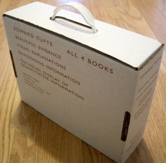
Today, a group of thirteen Vertigo folks, including myself, attended Edware Tufte’s one-day course on Presenting Data and Information in San Francisco. The course is $360 for the day, but that includes all four of Tufte’s books, which are currently going for about $141 new on Amazon. We had a group of more than ten, so we received the 25% group discount. The net cost is about $130 for a day with Tufte.
Once you start Tufte’s course, you’ll immediately realize why all four books are included in the course cost.
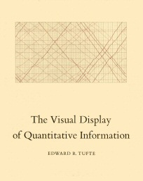
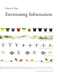
It’s not due to any particular generosity on Tufte’s part – he uses the books as high-resolution handouts. Tufte only uses projectors and computers for a handful of images and movies. Everything else begins with a scholarly “please turn to page (n) of your books.”
And they are truly wonderful books. I’ve been a Tufte fan for years, so I already owned a set, but it’s worth attending his course just to get the books.
His writing is fantastic, but it can be dry at times. I was surprised to find that Edward Tufte is a funny, animated speaker. We spent all morning reading through about a half-dozen sections in his last three books. Although I’ve read them all before, it was illuminating to have Tufte guide us through the reading selections and provide running commentary. It complemented the text nicely. He brought out a lot of nuances in the text that I completely glossed over in my initial read. The latter half of the day was split between sparklines and avoiding the pitfalls of PowerPoint. As usual, everything was presented directly from the books.
Should you attend a Tufte course? If you can swing it, and if there’s one in your area, I definitely recommend it. There’s nothing in the course you couldn’t get directly from the books yourself, but the material is always more effective when it’s presented by a good teacher.
As you enter the course, you’re provided a folded four-page handout. One of the highlights in this handout is a section titled “An Education for Analytical Design.” It’s a cheat sheet of sorts, and you know how I love cheatsheets. I’ll reprint it here exactly as Tufte entered it, adding hyperlinks for easier browsing:
An Education for Analytical Design
Fundamentals Josef Albers, Interaction of Color Robert Bringhurst, The Elements of Typographic Style Joseph Lowman, Mastering the Techniques of Teaching Scott McCloud, Understanding Comics Marcel Minnaert, Light and Color in the Outdoors Donald Norman, The Design of Everyday Things Strunk and White, The Elements of Style, the last chapter on style (read once a year) Norman J.W. Thrower, Maps and Civilization Edward Tufte, The Visual Display of Quantitative Information Edward Tufte, Envisioning Information Edward Tufte, Visual Explanations Edward Tuft, Beautiful Evidence
Advanced Readings Rudolf Arnheim, Visual Thinking William Cleveland, The Elements of Graphing Data and his Visualizing Data Eduard Imhoff, Cartographic Relief Presentation Stewart Brand, The Clock of the Long Now: Time and Responsibility Alan Cooper, About Face Ben Shneiderman, Designing the User Interface Philip Greenspun, Philip and Alex’s Guide to Web Publishing
Videos Video and book: Powers of Ten (watch video) by Philip Morrison and Phylis Morrison and The Office of Charles and Ray Eames; Sorting out Sorting (watch video) by Ronald Baecker; Project MATHEMATICS! (watch videos) by Tom M. Apostol and James F. Blinn
Internet www.google.com (also searches images!) www.aldaily.com www.bookfinder.com www.asktog.com www.amazon.com setiathome.ssl.berkeley.edu www.junkbusters.com www.photo.net www.science.nasa.gov www.musanim.com (to order the Music Animation Machine videotape)
Computer Programs For serious data analysis, use a high-end statistics package such as Origin 6.0, SYSTAT 8.0, Datadesk, STATA, SAS, SPSS, SigmaPlot, S-PLUS. See sparklines essay on Ask ET forum for more on production issues.
Courses Writing, general science, statistics (data analysis, research design), applied mathematics, cartography, medical illustration, architecture, publishing, typography, color, book design, film-making, computers, scientific visualization
Personal Favorites Christopher Alexander, Sara Ishikawa, et al., A Pattern Language; Robert Merton, On the Shoulders of Giants; Evelyn Waugh, Scoop; Italo Calvino novels; Gore Vidal literary essays; The Paris Review Interviews; Writers at Work (15 volumes); Paul Klee, Notebooks; Richard P. Feynman, Surely You Are Joking, Mr. Feynman, and “What Do You Care What Other People Think”
Some 20th Century Classics of Information Architecture
Hertzsprung-Russell Diagram, 1912. Relating the brightness of stars to their spectrum and temperature, this diagram showed the unexpected, brought together many dimensions of information into a coherent pattern, and has remained relevant for understanding the evolution of stars for nearly a century now. The diagram also accommodates the modern intensifying of information: the first plot contained 300 stars; recent diagrams show data from 93,000 stars.
Harry Beck, The London Underground Map, 1933. Beck’s diagram of the seven lines of the London Underground, though geographically inaccurate, provides a coherent overview of a complex system. With excellent color printing, classic British railroad typography, and, in the modern style, only horizontal, vertical, and 45 degree lines, the map became a beautiful organizing image of London. Despite 65 years of revisions due to the extensions of the Underground and bureaucratic tinkering with the design, the map nicely survives to this day. European and American knock-offs did not succeed.
Roger Tory Peterson, A Field Guide to The Birds, 1934. This book exemplifies the modern field guide, visually demonstrating to every reader the richness of biological diversity by means of “diagnostic marks” (pointers indicating small but telltale differences among birds). With some 5.5 million copies in print, the book got tens of millions of people outdoors looking at birds – and also thinking about how to preserve the diversity and complexity of nature.
Jan Tschichold and Penguin Books, 1947-1949. These inexpensive paperbacks brought the classics – and a good many current books as well – to the mass market. Tschichold set a consistent design for the Penguin books, with clear, elegant, timeless typography that endlessly serves the content.
Swiss Mountain Maps, Bundesamt Fur Landestopographie. Beautiful layering and separation, excellent three-dimensional effects (shading, contour lines, labels), superb resolution. The best national maps (of course, the Swiss have good content to work with!).
James D. Watson and Francis Crick, Molecular Structure for DNA, 1953. The double helix of DNA, a distinctly high resolution design, is Nature’s information architecture for all life forms. Since the two strands of the helix are complimentary, the very architecture suggests how DNA replicates itself and how genetic information is communicated from generation to generation.
NASA, Global Temperature Maps, 1960. For nearly 40 years, satellites have continuously measured the temperature of the Earth’s surface and atmosphere. High resolution visual displays provide the only way to comprehend these multidimensional data files of trillions of numbers that help to assess the long run history of global temperature change.
The OAG Pocket Flight Guide. A thousand pages of tiny type published each month on thin paper, this nice pocket book shows approximately 200,000 flight schedules. The guide gives control of the information – and therefore greater choice – to individual travelers, protecting them from the biases of travel agents and airlines. Used at the airport, this high resolution classic of information display also assists recovery from delayed or cancelled flights. Requires reading-glasses for those of a certain age.
Douglas Engelbart and Xerox Parc, The Graphical User Interface, 1965-1981. Until 10-15 years ago, the main way that humans interacted with computers was by remembering and typing. Now we look and point – at words and images, links, icons, menus, windows. The graphical user interface has given the computer to everyone (with enough money) and, combined with the laser printer, has led to more printed paper per capita than ever in human history! The quality of interface design may have peaked around 1990; too many computer screens today are overrun with operating system imperialism, featuritis, marketeering banners, and overproduced gimmicks.
Maya Lin, the Vietnam Veterans Memorial, 1985. From a distance the 58,000 dead soldiers arrayed on the black granite yield a visual measure of what 58,000 means, as the letters of each name blur into a gray shape. When the viewer approaches, these shapes resolve into individuals. The focus is on the tragic information; absent are the marble paraphernalia of other official monuments – big porticoes, steps and stairs, and the kitschy hyper-realistic generic soldiers.
The Internet and Email, 1990-. The greatest dispersion and intensification of information since the printing of books with moveable type in Korea and China around 650. Weaknesses: recency bias, short attention span, low credibility of many documents, low resolution in space and time.
That should be enough to keep us busy for a while. And be sure to check out the hilarious Viz-o-Matic video that E.T. showed during the class, too!