Revisiting “The Fold”
After I posted my blog entry on Treating User Myopia I got a lot of advice. Some useful, some not so useful. But the one bit of advice I hadn’t anticipated was that we were not making good use of the area “above the fold.” This surprised me. Does the fold still matter?
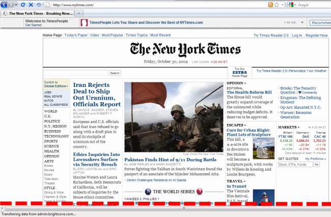
The fold refers to the border at the bottom of the browser window at the user’s default screen resolution. Like so:
Way back in the dark ages of 1996, it was commonly thought that users didn’t know how to scroll a web page.
On the Web, the inverted pyramid becomes even more important since we know from several user studies that users don’t scroll, so they will very frequently be left to read only the top part of an article.
Thus, it was critically important to cram in as much content in as possible above that fold, as anything below it was invisible to a huge number of users. They didn’t know how to scroll, so they would never find it. Jacob Neilsen, renowned usability expert, is the author of the above quote. But he recanted his position in 2003:
In 1996, I said that “users don’t scroll.” This was true at the time: many, if not most, users only looked at the visible part of the page and rarely scrolled below the fold. The evolution of the Web has changed this conclusion. As users got more experience with scrolling pages, many of them started scrolling.
Scrolling is an example usability versus learnability. It was always my belief that users quickly learned to scroll, otherwise they were permanently crippled as web citizens. If you can’t learn to scroll within an hour or so of using the web, you’re going to have an awfully stunted experience – so much so that you’re probably better off not using it at all. In short, if you use the web, you know how to scroll, almost by definition. It is a fundamental skill.
Even today, people will cite the ancient, irrelevant rule of The Fold as if it’s still law. In fact, I was just talking to a friend of mine who expressed his frustration at dealing with a middle manager who was using the “content must be above the fold” rule as a weapon, and demanding that all page content appear above the fold. It’s terribly misguided.
Although thoroughly debunked, there are still some hidden dangers from the fold, and subtlety to how users react to it. As documented by a recent usability study on the fold, there are three specific pitfalls to watch out for:
- Don’t cram everything in above the fold. Users will explore and find your content – as long as the page “looks” scrollable.
- Watch out for stark, horizontal lines that happen to line up with the fold. This is the only factor that causes users to stop scrolling, because the page looks done and complete. Instead, have a small amount of content just visible, poking up above the fold. This encourages scrolling.
- Avoid in-page scroll bars. The standard browser scrollbar is an indicator of the amount of content on the page that users learn to rely on. Placing <iframe> and other elements with scroll bars on the page can break this convention – and may lead to users not scrolling.
These are excellent guidelines, backed by actual eye tracking and experimental results. You know, science! But how do they apply to me? First, I established where the fold actually was. Per Google Analytics, about 25% of our users are using screen resolutions where the page fold is at about 700 or 800 pixels of height. And remember, browsers have a lot of horizontal chrome that tends to squander that height – toolbars, status bars, tabs, etcetera. The fold is probably much closer than you think it is.
Next, I looked at the advice I had been given regarding the top of the page. Sure enough, we had a bunch of irrelevant UI at the top that didn’t really matter: things like redundant page titles, and two line title entry. We were wasting critical real estate at the top of the page! For the 25% of users who have a 700 or 800 pixel fold, items were pushed down far enough that they might not actually be visible. Worse still, the strong bottom border of the text entry area with the drag slider could possibly align with the page fold itself – leading the user to believe that nothing is below there and failing to scroll.
It’s not only a basic rule of writing, it’s also a basic rule of the web: put the most important content at as close to the top of the page as you can. This isn’t new advice, but it’s so important that it never hurts to revisit it periodically in your own designs.
In treating user myopia, it’s not enough to place important stuff directly in the user’s eyepoint. You also need to ensure that you’ve placed the absolute most important stuff at the top of the page – and haven’t created any accidental barriers to scrolling, so they can find the rest of it. The fold is far less important than it used to be, but it isn’t quite as mythical as Bigfoot and the Loch Ness Monster quite yet.