I try not to talk too much about the trilogy here, because there's a whole other blog for that stuff. But some of the lessons I've learned in the last year while working on them really put into bold relief some of my earlier blog entries on usability and user behavior.
One entry in particular that I keep coming back to is Teaching Users to Read. That was specific to dialog boxes, which not only stop the proceedings with idiocy, but are their own delightful brand of user interface poison. Fortunately, you don't see dialogs in web apps much, but this sort of modal dialog lunacy is, sadly, becoming more popular in today's AJAX-y world of web 2.5. Those who can't learn from history are doomed to repeat it, I guess.
Having five more years of development experience under my belt, I no longer believe that classic Larson strip is specific to dialog boxes.
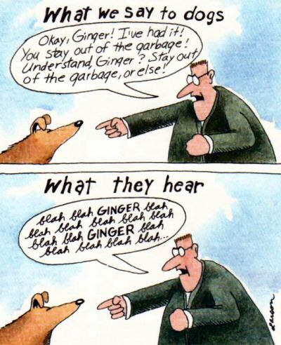
The plain fact is users will not read anything you put on the screen.
What we're doing with the trilogy is not exactly rocket surgery. At its core, we run Q&A websites. And the most basic operation of any Q&A website is – asking a question. Something any two year old child knows how to do.
When we launched superuser.com, that was our thirdfourth Q&A website. This one is for power users, and it's the broadest to date, topic-wise: most things dealing with computer software or hardware (that isn't gaming, or shopping) is allowed.
We've been at this for over a year now, doing nothing but relentlessly polishing and improving our Q&A engine based on community feedback. We're not particularly good, but we do try very, very hard not to suck. I thought surely, surely we must have something as simple as the ask question form down by now.
How foolish I was.
Let's take a look at one recent superuser question. I'm presenting it here as it would have been seen by the user who asked the question, while they were entering it on the ask question form.
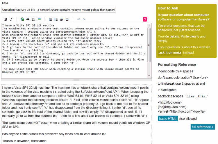
Immediately, there's a problem. The question formatting is completely wrong! It's one big jumble of text.
Our formatting rules aren't complicated. You can get a lot done with a bunch of simple paragraphs. We use Markdown, which offers basic formatting conventions that ape ASCII conventions. On top of that, we offer a real-time preview of how your question will look once submitted, directly under the question entry area. But none of that seemed to work for this particular asker, who, apparently, was totally satisfied with obviously broken formatting – even though a few choice carriage returns would have worked wonders, and been immediately visible in the live preview.
Yes, yes, it inevitably gets whipped into shape through the collective efforts of our legions of community editors – but that's not the point. It's best if the original asker gets the question formatted right to start with, and it is our job as UI designers to make that outcome as statistically likely as we can.
To that end, we've put a bunch of helpful tools on the ask question page to help users get the formatting right. As UI designers, here's how we see the ask question page:
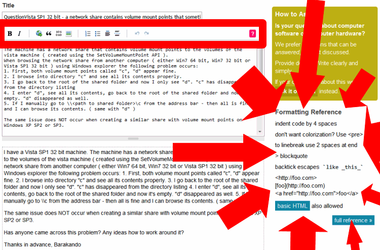
We've provided a toolbar with a neon pink help button above the question body, and to the right of the question body, we've provided a handy formatting quick reference with a link to the full formatting reference (which opens in a tab / new window by default).
But none of that matters, because here's how the user sees the ask question page:
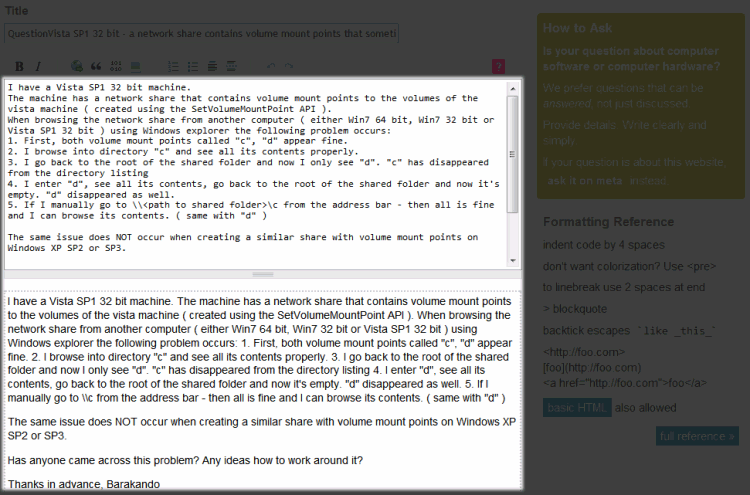
Or rather, here's everything the user doesn't see.
When I said users don't read anything you put on the screen, I was lying. Users do read. But users will only read the absolute minimum amount of text on the screen necessary to complete their task. I can't quite explain it, but this kind of user myopia is epidemic. It's the same problem, everywhere I turn.
How do we treat user myopia? How do we reach these users? The ask question page is already dangerously close to cluttered with helpful tips, but apparently these helpful buttons, links, and text are all but invisible to a large segment of the user population. Sure, you could argue that Super User tends to attract less sophisticated users, but I see the exact same problem with programmers on Stack Overflow. As new users, a significant percentage of them can't figure out how to format code, even though there's not only a toolbar button that does it for you, but help text on the right explicitly describing how to do it manually. (Just indent 4 spaces. Spoiler alert!)
More and more, I'm thinking we need to put the formatting help – for new users only – directly in their line of sight. That is, pre-populate the question entry area with some example formatting that is typical of the average question. Nothing complicated. But at least then it'd be in the one – and apparently the only one – place myopic users are willing to look. Right in front of their freakin' faces.
The next time you're designing a UI, consider user myopia. You might be surprised just how myopic your users can be. Think long and hard about placing things directly in front of them, where they are not just visible, but unavoidable. Otherwise they might not be seen at all.