
10 Foot Interface Showdown
Courtesy of MSDN Universal, I downloaded and installed Windows Media Center Edition 2005 on my home theater PC yesterday. It looks like the original reports were correct – MCE 2005 is more widely available at retail, too. Here are the relevant product links at newegg:
- Windows XP Media Center Edition 2005 – $140
- Remote Control for Microsoft Windows XP Media Center with Receiver- OEM – $40
- Hauppauge PCI Video Recorder, TV/FM Tuner Card, Model “WinTV-PVR250MCE” -RETAIL – $130
Yes, you do need a hardware MPEG-2 encoding card. Even the fastest 3.4ghz+ CPUs struggle with real time video encoding – at least, if you want to have any hope of multitasking without dropping massive numbers of frames in your recordings. I know the Hauppauge is a little expensive, but I’ve used the cheaper brands (I’m looking at you, Avermedia) and it isn’t worth it. Hauppauge has the most extensive third party support, so it’ll be useful outside MCE and have a longer life. Hauppauge is also introducing a new dual-tuner card if you absolutely, positively must record two shows at the same time – or watch live TV while recording another show.
MCE 2005 is the mythical third version of a Microsoft product, so at least in theory, this is as good as it’s going to get for a while. The improvements over 2004 are mostly incremental, but solid. Here are a few I consider significant:
- Built in video and audio CD/DVD burning
- Vastly improved movie browsing (automatic internet ratings, images, etc)
- Multiple tuner support
- Easily add network shares as music / video sources
MCE’s 10 Foot User Interface got a touch-up, too, but it’s still disappointing compared to the Tivo. I have my Tivo Series 2 directly under the MCE, and we use both systems on a daily basis, so a direct comparison is inevitable. Let me illustrate with two glaring examples.
My biggest complaint is MCE’s inexplicable use of telephone keypad entry for all alphanumeric fields:
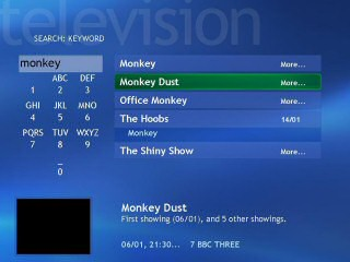
This is hideously painful to use. What number do I press? What character will I get? Ugh. Compare with the Tivo alternative:

Cursoring to the letter you want is incredibly intuitive. Obvious even. Everything that numeric keypad entry is not. Why couldn’t Microsoft copy an interface that actually works? Any time you’re cribbing UI from a telephone, you are in deep, deep trouble.
The other criticism I have is that Microsoft forces me to use an additional Back button on my remote. This is particularly onerous coming from the elegance and simplicity of Tivo’s design:
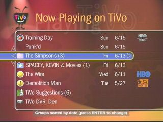
In the Tivo UI, cursor left takes you back a page, and cursor right takes you forward into your selection. There are screens that violate this rule (e.g., the search page, above) but it is quite intuitive. You start to associate the left side of the screen with “backwards,” and the right side with “forward,” rather like a Wizard interface, or a VCR. The only side effect – and I think it’s a positive one – is that most Tivo UI screens are a simple vertically scrolling list of selections.
I don’t mean to be overly critical of MCE. It’s a fantastic product. It’s just hard to stomach these obvious lost opportunities for copying UI elements that are so stunningly effective on the Tivo. Why reinvent a square wheel?