Coding Horror

programming and human factors

History of the OK Button

Our old friend, the OK Button, has gone through a few visual tweaks in the last twenty years of Windows:

OK Button, Windows 1.0

OK Button, Windows 3.1

OK Button, Windows 95

OK Button, Windows XP

OK Button, Windows Vista

There is one constant, however: the use of OK. It's an abbreviated form of Okay. But where did this word, and its convenient two-letter abbreviation, come from? The question is answered in this straight dope column on the etymology of OK:

The etymology of OK was masterfully explained by the distinguished Columbia University professor Allen Walker Read in a series of articles in the journal American Speech in 1963 and 1964.

The letters, not to keep you guessing, stand for "oll korrect." They're the result of a fad for comical abbreviations that flourished in the late 1830s and 1840s.

Read buttressed his arguments with hundreds of citations from newspapers and other documents of the period. As far as I know his work has never been successfully challenged.

The Wikipedia entry on OK offers many other theories on the etymology of the word-- but the timing of the first written appearance seems to support Reed.

Discussion

Users Don't Care About You

Seth Godin showed this slide during a recent presentation at Google:

Users don't care about YOU.

What's the biggest web design mistake of 2004?

1. Believing people care about you and your web site.

Why isn't anyone reading our blog?

1. You're not a good-looking female who likes posting naked pictures of herself.
2. There's nothing in it for them.

This is not to say that users don't care:

The main point: users don't care about you as much as they care about themselves.

Users just aren't that into you. It's not personal. It's business. Unless what you're writing …

  • solves their problem
  • provides useful information
  • entertains them
  • makes them feel like they rule

… it's irrational to expect users to care about it.

Every time you create something – whether it's a website, a client app, a blog post, a powerpoint presentation, or an email – ask yourself, "so what?" If you can't answer that question convincingly, reformulate and try again.

Discussion

SDWest 2006: My McConnell Moment

I'll be attending SDWest 2006 all next week (March 13 - 17) in Santa Clara, California.

If you're attending, let's meet up somewhere! I've met a handful of people in person at past conferences:

The highlight of SDWest, however, will hopefully be meeting Steve McConnell, who is giving the keynote on Monday.

I-heart-steve-mcconnell.jpg

McConnell was my first coding hero.*

I discovered his book Code Complete in 1994 and it was a revelation. Programming is such a solitary pursuit, and particularly so in those pre-internet days. In Code Complete, I found an amazingly passionate, incredibly literate, and consummately professional programmer to learn from. Code Complete convinced me that writing software is what I want to do for the rest of my life. The book-- now upgraded to version 2.0-- has been my bible ever since.

Update: Steve was very gracious, talking at some length with me both before and after his keynote. He even signed my copy of Code Complete 2. As he said, "I guess I should sign on a page with a Coding Horror":

To Jeff Atwood, with every good wish. Hope my signature isn't too horrifying! Steve McConnell, Santa Clara, CA. March 13 '06

Who are your coding heroes-- and why?

* and hey, I'm not the only one.

Discussion

Doing It Like Everyone Else Does

Jon Galloway called me out in a comment yesterday for advocating a non-standard approach:

Web forms have become a convention, and users have been trained for 10 years on how to fill out forms. Users would get confused, and some would bail out (abandon carts, etc.). Web forms work, and we know how to use them. Your form example violates the "Don't Make Me Think" principle on many levels.

In a sense, he's right. When it comes to coding, as Steve Rowe points out, always favor consistency over cleverness:

The class isn't the main point of this post, however. Rather, it is some advice that Peter gave a few times during the class. Someone might ask a question like "Can't I do x in some funky way?" and he would answer, "You could, but no one would expect to see it so don't." The point he was making is that we, as programmers, should stay away from being clever. We should, as much as possible, try to do things the same way everyone else does them. Why? Because you won't be the only person to work on this code. Even if you are, the next time you touch it might be a year or two from now. If you did something clever, the next person to touch it will look at the code and not immediately understand. This will have one of two consequences. Either they will have to spend 10 minutes just trying to understand what it is you did or, worse, they will assume you made a mistake and "fix" it by making it less clever. Neither of these results is desireable. Unless you are writing one-off code for yourself you need to write it in a manner to make it easily understandable so that it can be easily maintained.

It's clearly a bad idea to write code with a "how 'bout we try it this way" mentality, as humorously noted by Alex Papadimoulis:

"A client has asked me to build and install a custom shelving system. I'm at the point where I need to nail it, but I'm not sure what to use to pound the nails in. Should I use an old shoe or a glass bottle?"

a) It depends. If you are looking to pound a small (20lb) nail in something like drywall, you'll find it much easier to use the bottle, especially if the shoe is dirty. However, if you are trying to drive a heavy nail into some wood, go with the shoe: the bottle with shatter in your hand.

b) There is something fundamentally wrong with the way you are building; you need to use real tools. Yes, it may involve a trip to the toolbox (or even to the hardware store), but doing it the right way is going to save a lot of time, money, and aggravation through the lifecycle of your product. You need to stop building things for money until you understand the basics of construction.

However, when it comes to issues of user interface, consistency isn't always a virtue. User interfaces should be internally consistent, but not necessarily consistent with every other application in the rest of the world. That said, some UI elements become so ingrained into popular culture that they should be followed for consistency's sake. Some good examples are:

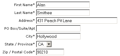
  • A search box in the upper-right hand corner
  • A logo in the upper-left hand corner that takes you back home
  • The "forward" and "back" buttons

But not all user interface conventions are created equal. Some are timeless. Some are there by default, because nobody bothered to sufficiently question them. Some grow old and outlive their usefulness. How do we discriminate between conventions that actually help us and those that are merely.. expected?

The answer, of course, is to try multiple approaches and collect usage data to determine what works and what doesn't. This is (relatively) easy for web apps, which is why Amazon, Yahoo and Google are all notorious for doing it. They'll serve up experimental features to a tiny fraction of the user base, collect data on how those features are used, then feed that back into their decision making process.

If we built UI with an iron-clad guarantee that we would "do it like everyone else", would we have ever experienced the ultra simple Mom-friendly Tivo UI? Or Windows Media Center's amazing, utterly un-Windows-like ten foot UI? Would Office 12 be using the innovative new ribbon instead of traditional toolbars and menus? Heck, would we have ever made the transition from character mode to GUIs?

I think UI experimentation is not only desirable, but necessary. If we don't experiment, we can't evolve UI forward. However, you have to do it the right way:

  1. Have a complete understanding of the current convention and how it arose
  2. Have a good, reasoned argument for deviating from the convention
  3. Collect usage data on your experiments
  4. Make decisions based on the usage data

If you're not collecting usage data, or your reason is "it looks better this way", then you're doing it wrong, and you should stick with the conventions.

Discussion

Web Forms: Death By a Thousand Textboxes

Why do HTML forms have to be death by a thousand tiny textboxes?

The classic example of this is phone number, which typically forces you to tab through three annoying little textboxes to enter a single number:

telephone number in multiple textboxes

Why can't we let the user enter the number however they like, and accept lots of formats?

telephone number in a single textbox

Yes, it's a bit more work for the programmer. But who cares? The developers will only code and debug this once. Users, however, will be forced to enter thousands of telephone numbers in that tedious, time-consuming tiny textbox way. Forcing hundreds of users to do more work to make a single programmer's life slightly easier is a false economy.

I also wonder why we have to enter addresses in a bunch of textboxes.

A traditional HTML address entry form

Wouldn't it be easier if I just filled out a mailing label and typed my address exactly the same way I write it?

usps-priority-mailing-label-form.png

Everyone has filled out an address label before. It's completely and utterly intuitive, even if you live in another country.

I realize this doesn't work for the entire order form. We still need to collect email address, phone numbers, and so forth. But it sure would make the address entry a lot easier -- and more obvious -- for the users.

We have to stop optimizing for programmers and start optimizing for users.

Discussion