Coding Horror

programming and human factors

Quad Core Desktops and Diminishing Returns

Dual core CPUs were a desktop novelty in the first half of 2005. Now, with the introduction of the Mac Pro (see one unboxed), dual core is officially pass. Quad core-- at least in the form of two dual-core CPUs-- is where it's at for desktop systems.

Task Manager with 4 CPUs

And sometime early next year, the first true quad core CPUs will hit the market.

I think there are clear multitasking benefits in a dual-core configuration for typical computer users. All you need to do is run two applications at once, and who doesn't do that these days?

However, the benefits from moving to quad-core and beyond are less clear. Effectively utilizing 4 or 8 CPU cores requires extremely aggressive multithreading support within applications. How aggressive? Rewrite your entire application in a new language aggressive. That's a much more difficult problem. It's also not a common optimization, except within very specific application niches.

Dual CPU desktop systems weren't twice as fast as single CPU desktop systems. But they were a substantial, worthwhile speed bump. With quad CPU systems, we've hit the point of diminishing returns.

Current benchmark data definitely bears this out. I distilled results from these GamePC and TechReport reviews of the Opteron 275 (dual core 2.2 GHz), which also included the Opteron 247 (single core 2.2 GHz). It's an apples-to-apples comparison between Dual and Quad configurations of an Athlon 64 running at the same speed-- 2.2 GHz.

  Dual CPU Quad CPU  
3D Studio Max 7.0 Radiosity Render 239 144 1.7 x
POV-Ray chess2.pov 144 87 1.6 x
Cinebench 2003 Rendering 571 1021 1.8 x
Alias Maya 6.0 Zoo Render 49 43 1.1 x
Photoshop CS Filter Benchmark 146 131 1.1 x
Flash MX 2004 MPEG import 37 35 1.1 x
Windows Media Encoder 9.0 MPEG to WMV 125 119 1.1 x
Xmpeg/DivX encoding 71 75 1.1 x
LAME 3.97 WAV to MP3 69 67 none
Apache 2.0 10k user stress test 1397 1478 1.1 x
Apache 2.0 50k user stress test 1346 1875 1.4 x
Sysmark 2004 226 242 1.1 x
Half-Life 2: Airboat chase 95 96 none
Doom 3: Site 3 timedemo 164 166 none
3DMark05 5244 5244 none

I eliminated most of the synthetic benchmarks; I tried to focus on real desktop applications that people actually use. The Sysmark 2004 results are particularly telling.

However, the results I did find are so poor that I wonder if any quad CPU system is good for much more than bragging rights. Of the desktop apps, only three truly benefit from a quad CPU configuration: 3D Studio Max, POV-Ray, and Cinebench 2003. Notice a pattern? Rendering and encoding tend to parallelize well.

Unless you're often running a specific application that is optimized for multithreading, there's no compelling reason to run out and buy a quad-CPU desktop system today. And I don't see that advice changing over the next few years. At least, not until the state of software development changes quite radically to embrace multithreading across the board.

Discussion

Properties vs. Public Variables

I occasionally see code with properties like this:

private int name;

public int Name
{
    
get { return name; }
    
set { name = value; }
}

As I see it, there are three things to consider here.

  1. When is a property not a property? When it's a glorified public variable.

    Why waste everyone's time with a bunch of meaningless just-in-case wrapper code? Start with the simplest thing that works-- a public variable. You can always refactor this later into a property if it turns out additional work needs to be done when the name value is set. If you truly need a property, then use a property. Otherwise, KISS!

    Update: As many commenters have pointed out, there are valid reasons to make a trivial property, exactly as depicted above:

    • Reflection works differently on variables vs. properties, so if you rely on reflection, it's easier to use all properties.
    • You can't databind against a variable.
    • Changing a variable to a property is a breaking change.

    It's a shame there's so much meaningless friction between variables and properties; most of the time they do the exact same thing. Kevin Dente proposed a bit of new syntax that would give us the best of both worlds:

    public property int Name;
    

    However, if the distinction between variable and property is such an ongoing problem, I wonder if a more radical solution is in order. Couldn't we ditch variables entirely in favor of properties? Don't properties do exactly the same thing as variables, but with better granular control over visibility?

  2. Distinguishing public and private using only case is an accident waiting to happen.

    The difference between name and Name is subtle at best. I don't want to reopen the whole case sensitivity debate, but using case to distinguish between variables is borderline irresponsible programming. Use a distinction that looks and reads different: m_name, _name. Or maybe eschew prefixes altogether and use fully qualified references: this.name. I don't really care. But please, for the love of all that's holy, don't abuse us with even more meaningless case sensitivity.

  3. Is it a property or a method?

    In this case, we barely have a property. But if you are executing code in a property, make sure you've written a property and not a method. A property should do less work-- a lot less work-- than a method. Properties should be lightweight. If your property incurs significant effort, it should be refactored into an explicit method. Otherwise it's going to feel like an annoying side-effect of setting a property. And if there's any chance at all that code could spawn an hourglass, it definitely should be a method. Conversely, if you have a lot of simple, lightweight methods, maybe they ought to be expressed as properties. Just something to think about.

The really important thing to take away here is to avoid writing code that doesn't matter. And property wrappers around public variables are the very essence of meaningless code.

As for the rest, I've learned to take a "live and let live" approach to code formatting, at least for cosmetic stuff like variable names. When in doubt, try to follow the Microsoft internal coding guidelines unless you have a compelling reason not to.

But a few things still get under my skin. I've even seen .NET constants expressed in the old school all-caps way:

static const int TRIGGER_COUNT = 100;

All style guidelines aside, you know that ain't right.

Discussion

Filesystem Metadata Doesn't Scale

Although I always use CDDB metadata in my self-ripped MP3 files, the quality of the ID3 tags in my MP3 files lags far behind the quality of the file and folder names.

File and folder naming is immediately visible and easy to change.

C:MusicBeatlesThe White AlbumDisc 1�1 - Back in the USSR.mp3

Metadata tucked away inside a binary file.. isn't.
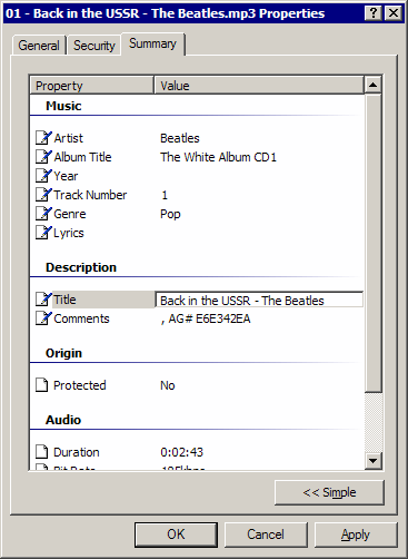
Windows XP mp3 file properties dialog, summary tag, advanced button

But Windows Media Player doesn't care a whit about my painstakingly constructed file names and folder trees. It ignores them completely in favor of the metadata inside the MP3 file to categorize music in its "media library". I've never used iTunes, but from what I've read, I understand it works the same way. To ignore obvious, simple external filesystem metadata in favor of complex internal ID3 metadata is doing a disservice to the user. But that's exactly how most media applications work!

It's also a case study in the difference between text and binary files. In the Googleland of web pages, everything is text, and therefore it's possible for everything to be self-describing and self-indexing. That's why Google ignores metadata on the web. Text files don't need metadata. Or even a filename. The words inside the text file describe it better than any human generally will. Human metadata is highly suspect; people aren't capable of creating objective metadata for their own content. Plus, there's money to be made, and a dozen other reasons the <meta> tag is all but irrelevant these days.

In the world of binary data-- music, pictures, and video-- there's no text inside the file to work with. For binary files, metadata isn't an optional nice to have. It's required. For example, when you perform a Google image search on "Wozniak", you're really searching the image metadata. If you get results, it's because..

  • Some text near the image contains the word "wozniak"
  • The alt tag for the image contains "wozniak"
  • The filename for the image contains "wozniak"

Given how little metadata the image search has to work with, it's amazing that it works as well as it does..

Steve Wozniak and David Lee Roth

.. but it still doesn't work very well. You just can't search binary content properly without structured metadata.

And that's why iTunes and Windows Media Player are so insistent about using the ID3 tags inside the MP3 files. Folders and filenames get awkward quickly. Everyone has a different organization method. One folder per Genre? Folders A-Z? One folder per Artist? Dashes, underscores, or semicolons for delimiters? Should filenames contain the information, or just the folders? Should the artist or the album come first? The larger your music library grows, the more unwieldy it is to organize using folders and filenames.

ID3 tags are more work, but they're far more effective. If you have proper ID3 tags, you can synthesize any file and folder structure you want. And searching your music collection is easy and fast, too.

That's why I've decided to buckle down and standardize all the ID3 tags in my MP3 collection. It's giant-- currently 10,970 songs and 733 albums in 48.9 gigabytes. I'm maniacal about ripping my own MP3 files with VBR encoding using Audiograbber and LAME. Proper ID3 tagging and album art also means my library will (finally) show up nicely in the music browser for my always-on, low-power optimized home theater PC running Windows Media Center.
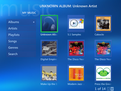
Windows Media Center, My Music

Large hard drives have come down a lot in price, so it's now feasible to consolidate all my media storage on the HTPC with a single quiet 500gb data drive.

With this many songs to organize, going into a properties dialog for each file is clearly out of the question. The two ID3 tag organizing utilities I saw recommended most were Tag & Rename and MediaMonkey. I didn't get around to trying Tag & Rename, because I was blown away by how amazingly great MediaMonkey is. I can't recommend it strongly enough. The free version includes all the essential ID3 tag maintenance functions you'd ever need:

  • An easy way to grab all album information from Amazon, including cover art, track details, year, and artist information.
  • Flexible translation back and forth between filesystem metadata and ID3 metadata, with a real time "as you type" preview of what will happen. This is a killer feature!
  • Visualize your library by folder or metadata to quickly find errors, typos, and miscategorizations. Then drag and drop to fix them.
  • Built-in tools to fix common stuff like Title/Artist reversal (depressingly common), casing problems, duplicate content, etcetera.
  • Designed for large music libraries. It's super fast at writing tags. It also queues updates intelligently; I did complete updates of 10,000+ tags several times.

It's an incredibly well-written app. It does everything right, including little stuff like automatic population of autocomplete drop-downs for every ID3 field based on your existing library. However, I do recommend switching to ASCII tags; it defaults to Unicode by default, which most people won't need, and this doubles the size of the tags.

Even with a great tool, fixing this much metadata was an incredibly tedious and thankless task. I don't even want to think about how much time I've spent on this. There's a lot of human error enshrined in the CDDB data:

  • Track and Title reversed
  • Spelling errors
  • Grammar errors
  • Casing problems; all lower case is common
  • Missing important tags

Very few things in CDDB are totally wrong, however. If Wikipedia can work, so can CDDB (or something like it). It's a question of making the editing process as easy and obvious as possible, so these minor mistakes get fixed over time.

Beyond minor mistakes, metadata is a vast, grey wasteland of indeterminisms. Which of these is correct?

  • "Eno, Brian" or "Brian Eno"?
  • "Cardigans" or "The Cardigans"?
  • "Earth Wind & Fire", or "Earth, Wind & File", or "Earth, Wind and Fire"?
  • "Rock" or "Pop"?
  • Does the Year field mean year of original song release or year of album release?

The correct answer is "all of the above". And then some.

Although I've been generally happy with the results of the ID3 tagging, there is one notable piece of ID3 metadata missing. I own lots of multi-disc sets. Unfortunately, there's no ID3 tag for disc number, eg, "Disc 3 of 12". I can't find any ID3 tag (at least, none that are visible in MediaMonkey) that looks appropriate. So I end up tacking the disc number on to the album title, which seems a little hokey. *

I suppose the true lesson here is that I should have been more diligent about editing metadata at the time I ripped the albums instead of deferring all the work until now. Trying to infer metadata through the filesystem seems like a workable solution, but it isn't. Filesystem metadata just doesn't scale.

* Update: this is the TPOS tag, and it's exposed in the UI for iTunes and Tag & Rename. It does not appear anywhere in MediaMonkey, which is an odd oversight.

Discussion

A Spec-tacular Failure

I've written before about the dubious value of functional specifications. If you want to experience the dubious value of specifications first hand, try writing a tool to read and write ID3 tags.

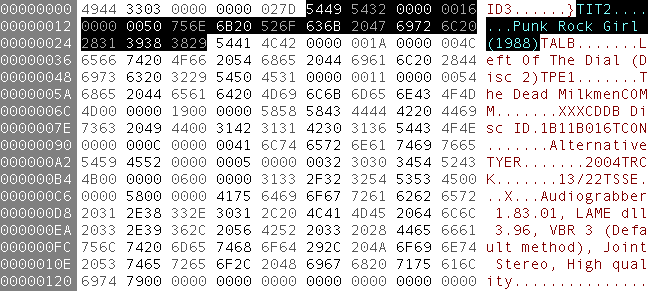
ID3 tags describe the metadata for an MP3 file, such as Artist, Album, Track, and so forth. ID3 tags certainly don't look all that complicated. Newer versions appear at the beginning of the MP3 file, and are nearly human readable even in a hex editor:

ID3 tag displayed in a hex editor

There's a set of comprehensive ID3 specifications to help us out. Unfortunately the ID3 specs are, in a word, bad.

Even with a bad spec, you can write code to parse ID3 tags. There are a number of CodeProject articles that read and write ID3 tags with varying levels of success. There's also a mature .NET ID3 library available, UltraID3Lib, but unfortunately it's closed source. It also suffers a little from explosion at the pattern factory design.

One of the first big warning signs is this list of ID3 "offenders" on the UltraID3Lib site. It reads like a who's who of music applications: iTunes, WinAmp, Windows Media Player. If the applications that ship with the operating system can't get ID3 tags right, clearly something is wrong.

And that something is the ID3 spec. How does it suck? Let me count the ways:

  • The spec shows how but rarely explains why. For example, frame sizes are stored as 4-byte "syncsafe integers" where the 8th bit of every byte is zeroed. Why would you store size in such an annoying, unintuitive format? Who knows; the spec doesn't explain. You just grit your teeth and do it.

  • The vast majority of the things described in the spec do not appear in any MP3 files that I can find or create. There are 70+ possible frame types, but I've only seen a dozen or so in practice. And what about encryption? Compression? CRC checks? Footers? Extended headers? Never seen 'em. And I probably never will. But I still have to parse through pages and pages of detailed text about these extremely rare features.

  • The spec has ridiculous enumerations. Check out the 147 possible values of the music genre byte. The existing 147 categories seem to be chosen completely at random. For example, "Negerpunk" (133), "Christian Rap" (61), and "Native US" (64). And evidently "Primus" (108) isn't just a band, they're a valid music genre, too. iTunes thankfully puts a stop to this madness by only displaying a fraction of these genres in its genre drop-down. And it isn't just the genre tag; one of the possible picture types for the attached picture tag "APIC" is-- and I swear I'm not making this up-- "A bright coloured fish" ($11). At some point you feel like you're wasting your time by enumerating insanity.

  • No examples are provided. Consider the comment frame. This is a relatively complex frame; it supports multiple languages and different encodings. It also supports multiple comments per frame with descriptive labels for each one. And yet it only merits a paragraph in the frames specification, with no examples of usage whatsoever. Would it kill them to provide a couple examples of how a comment should actually look?

  • Related items are not together. The comment frame has two lookups in its header: language and text encoding. There is absolutely no reference at all to these lookup tables in the comment frame description. You have to "just know" that the main ID3 spec defines all languages with three character ISO-639-2 language codes, and that there are four possible text encodings from 00 to 03, with different rules for null termination. It'd be awfully difficult to write a comment tag reader without this information, yet it's nowhere to be found in the description of the comment tag.

The ID3 spec is doubly frustrating because it makes a simple topic difficult. ID3 tags are just not that complicated. The spec makes me feel like an idiot for not being able to get this stuff right. What's the matter? Can't you read the spec?

No. I can't. And evidently, neither could the developers of WinAmp, iTunes, or Windows Media Player.

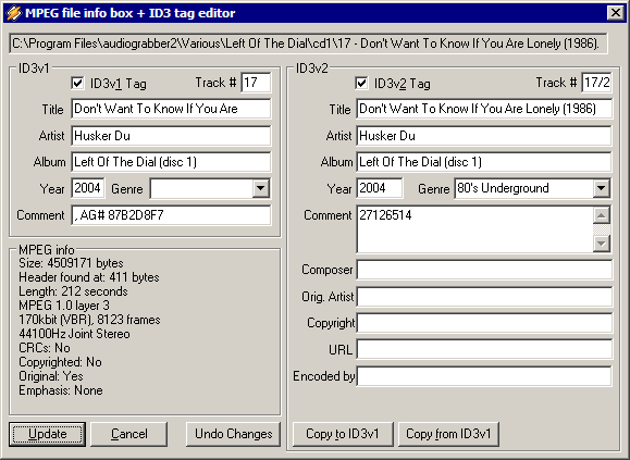
Since the ID3 spec is so deficient, I've been using the behavior of popular applications as a de-facto spec. In other words, I test to see how WinAmp behaves when editing ID3 tags:

WinAmp file info dialog

WinAmp isn't a model ID3 tag citizen. It ignores all comments except for the first one, and it adds garbage text as the language string for comments.

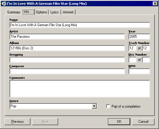
I also test to see how iTunes behaves when editing ID3 tags:

iTunes file info dialog

Although iTunes reads all versions of ID3 tags, it still writes ancient v2.2 ID3 tags to MP3 files, even in the latest version. So it's an especially poor role model for tagging.

Warts and all, the practical implementations of ID3 tags in popular applications like WinAmp and iTunes trump anything that's written in the formal ID3 spec. I finally understand what Linus Torvalds was complaining about:

A "spec" is close to useless. I have never seen a spec that was both big enough to be useful and accurate. And I have seen lots of total crap work that was based on specs. It's the single worst way to write software, because it by definition means that the software was written to match theory, not reality.

Specs, if they're well-written, can be useful. But they probably won't be. The best functional spec you'll ever have is the behavior of real applications.

Discussion

My Love/Hate relationship with ClearType

I've been vacillating a bit on ClearType recently. I love ClearType in theory. A threefold improvement in horizontal resolution on LCDs is an incredible step forward for computer displays. Internet Explorer 7 forces the issue a bit by always defaulting to ClearType for web content, even if you haven't enabled ClearType in Windows XP.

To sweeten the pot even further, Consolas, one of the best (if not the best) fixed-width fonts I've ever seen, is only usable with ClearType enabled.

But in practice, I keep running into problems with ClearType enabled that drive me absolutely bonkers. Check out this shot of Hex Workshop, using the Consolas font, with ClearType enabled:

hex-workshop-cleartype-default.png

What's up with the hideous halation effects around the selected characters? It's unbearable! The obvious RGB noise around the characters is not helping readability at all.

Fortunately, the ClearType Tuner PowerToy lets us tweak this for the better. Switch to the advanced tab so you can use the ClearType Contrast Setting slider. The slider has a range of 1.0 to 2.2, and the changes take effect in real time.

Here's a shot of the same window with 2.2 contrast, the lightest possible.

hex workshop screenshot with cleartype set to minimum contrast

The effect is exacerbated by reducing the contrast, so clearly we have a contrast problem. Let's try turning it all the way up.

Here's a shot of the same window with 1.0 contrast, the darkest possible.

hex workshop screenshot with cleartype set to maximum contrast

Maximum contrast looks good, but it has an unwanted side effect as well-- now bold text looks terrible! Compare for yourself. Minimum contrast at the top, standard in the middle, and maximum at the bottom.

 ClearType bold text, minimum contrast

 ClearType bold text

 ClearType bold text, maximum contrast

Bold text looks best with contrast set to minimum. I just can't win.

I'm currently compromising by sliding the contrast slider over a few notches toward the darker side-- a setting of 1.4 versus the default of 1.6. But no matter how I tweak the slider, there are always places where the text is less legible with ClearType on. Sometimes pathologically so.

I guess it's back to standard greyscale font smoothing for me. It's too bad, because I love Consolas, and I think ClearType is genius-- if they could get it to look good in all situations, and not just for black text on a white background.

Discussion