
Code Colorizing and Readability
Most developers, myself included, are content with syntax coloring schemes that are fairly close to Visual Studio’s default of black text on a white background. I’ll occasionally encounter developers who prefer black backgrounds. And I’ve even seen developers who prefer the white on blue scheme popularized by DOS Wordperfect.
I vaguely recall reading somewhere that black on white was the most readable of all color schemes. I found two studies with actual data based on real-world tests with users:
From these results, one can say that contrast affects legibility, but unfortunately, it does not seem to be as simple as high contrast being better than low contrast. In the main experiment, Green on Yellow had the fastest RT’s, and in the control experiment, medium gray, and dark gray had the fastest RT’s. In neither experiment did the Black on White condition show the fastest RT’s. These results show that these participants had faster response times when more median contrasts were used. These results supported Powell (1990), who suggested avoiding sharp contrasts, but did not fully support Rivlen et al. (1990), who suggested maintaining high contrast.
According to a manual by AT&T; (1989), the direction of the contrast (dark on light, or light on dark) might also affect legibility. When light text is placed on a dark background the text may seem to glow and become blurred; this is referred to as halation, and it may make the text harder to read. Some evidence for an effect of halation was found in the current experiment.
As you can see, the most readable color combination is black text on white background; overall, there is a stronger preference for any combination containing black. The two least readable combinations were red on green and fuchsia on blue. White on blue and red on yellow were ranked fairly high, while green on yellow and white on fuchsia were ranked fairly low. All others fell somewhere between these extremes. Also, in every color combination surveyed, the darker text on a lighter background was rated more readable than its inverse (e.g. blue text on white background ranked higher then white text on blue background).
So, yes, there’s definitely data to support the black on white status quo. After a quick trip into the Environment, Fonts and Colors section of the Visual Studio Options dialog, I captured these screenshots. Compare for yourself:
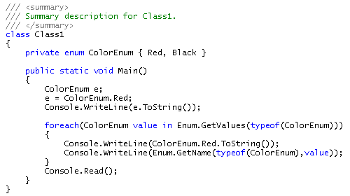
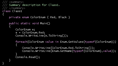
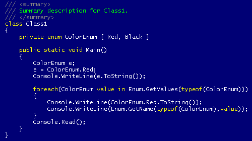
I’ll take any of these schemes over the non-colorized Notepad version, but I feel very strongly that black on white color schemes are the way to go for overall readability.
Interestingly, this is also true of bibles.


