UI-First Software Development
We’re currently in the midst of building the new web property I alluded to in a previous post. Before I write a single line of code, I want to have a pretty clear idea of what the user interface will look like first. I’m in complete agreement with Rick Schaut here:
When you’re working on end-user software, and it doesn’t matter if you’re working on a web app, adding a feature to an existing application, or working on a plug-in for some other application, you need to design the UI first.
This is hard for a couple of reasons. The first is that most programmers, particularly those who’ve been trained through University-level computer science courses, learned how to program by first writing code that was intended to be run via the command line. As a consequence, we learned how to implement efficient algorithms for common computer science problems, but we never learned how to design a good UI.
Of course, UI is hard, far harder than coding for developers. It’s tempting to skip the tough part and do what comes naturally – start banging away in a code window with no real thought given to how the user will interact with the features you’re building.
Remember, to the end user, the interface is the application. Doesn’t it make sense to think about that before firing up the compiler?
It’s certainly true that there are limitations on how the UI can be built based on the technology you’re using. Just because some pixels can be arranged a certain way in Photoshop doesn’t mean that can magically be turned into a compiling, shippable product in any sane timeframe. To ameliorate that problem, take advantage of visual design patterns. If you’re building a GUI application, use a palette of widgets common to your GUI. If you’re building a web application, use a palette of HTML, CSS, and DOM elements from all over the web. Let the palette enforce your technology constraints.
It shouldn’t be difficult to sit down with a few basic tools and slap together a rough mockup of how the user interface will look. However, it is extremely important at this point to stay out of technical development environments when mocking your user interface, or the temptation to turn the model into the product may be too strong for your team to resist. Try to avoid the prototype pitfall.
So how do we prototype the UI without relying on our development tools? One way is simple paper prototyping.
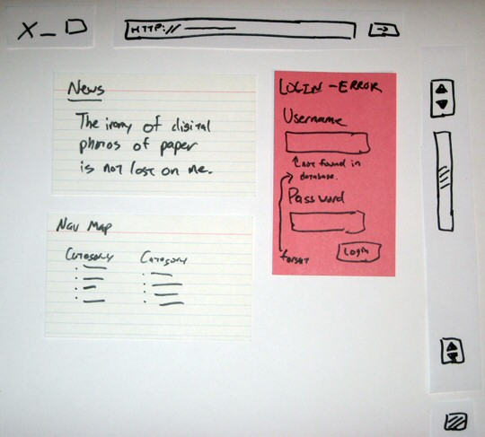
The book Paper Prototyping: The Fast and Easy way to Design and Refine User Interfaces is an excellent introduction to paper prototyping. You can interactively browse sections of this book at Amazon, through Google Books, and the book’s own dedicated web site.
There’s a certain timelessness to paper prototyping that holds a deep appeal, as Jacob Nielsen points out:
Paper prototyping has a second benefit, besides its impact on your current design project’s quality. It will also benefit your career. Consider all the other books you’ve read about computers, Web design, and similar topics. How much of what you learned will still be useful in ten years? In twenty years? In the immortal words of my old boss, Scott McNealy, technology has the shelf life of a banana.
In contrast, the paper prototyping technique has a shelf life closer to that of, say, paper. Once you’ve learned paper prototyping, you can use it in every project you do for the rest of your career. I have no idea what user interface technologies will be popular in twenty years, but I do know that I’ll have to subject those designs to usability evaluation, and that paper prototyping will be a valuable technique for running early studies.
Paper prototypes are usually pitched in terms of doing low-fi usability studies, and rightly so. But I find a paper prototype tremendously helpful even if I’m the only one that ever sees it. I need to create an image in my mind of what I’m building, as it will be seen by the world, before I start pouring the concrete to make it real.
If you need any more convincing that paper prototyping is an incredibly valuable tool – even for mere developers – consider the advice of Jared Spool’s company, User Interface Engineering:
- Paper Prototypes: Still Our Favorite (1998)
- Five Paper Prototyping Tips (2000)
- Looking Back on 16 Years of Paper Prototyping (2005)
I also recommend reading through Common Concerns about Paper Prototyping if you’re still on the fence.
But what happens when you outgrow paper prototyping? Jensen Harris, one of the principal UI designers on the Office 2007 team, first introduced me to PowerPoint prototyping:
We use PowerPoint as kind of a better version of [Office 2007] paper prototypes. This technique has several advantages: prototypes can be made to feel somewhat interactive, because the content is electronic it can be modified more easily than paper, and (best of all) the usability participant uses the mouse and is on the computer, so it feels natural to them.
Of course, it doesn’t have to be PowerPoint. Use whatever tool you like, as long as it’s not a development tool. You don’t want something too powerful. What you want is mild interactivity while remaining simple and straightforward for quick iterative changes. That’s the logical next step up from paper prototyping.
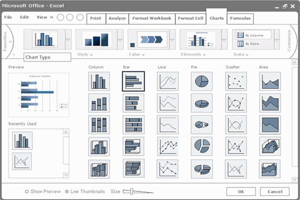
It’s a lot easier to share this digital artifact on a distributed team than it is to share a bunch of physical paper. If you’re curious about the nuts and bolts of PowerPoint prototyping, dig in:
- Wireframe prototyping using PowerPoint 2007 (Manuel Clement, 26 minute video)
- Step-by-Step Guide to PowerPoint Prototyping (Jan Verhoeven)
- PowerPoint Prototyping Toolkit (Long Zheng)
The pursuit of UI-First software development is more important than any particular tool. Use paper, use PowerPoint, use Keynote, use whatever makes sense to you. As long as you avoid, in the words of Manuel Clement, pouring concrete too early.
How does your team practice UI-First software development?


