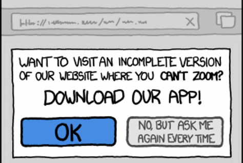
Training Your Users
When it comes to user interface design, I’m no guru, but I do have one golden rule that I always try to follow:
Make the right thing easy to do and the wrong thing awkward to do.
The things you want users to do should be straightforward and clear – as simple as falling into the pit of success. Make your software easy to use. Duh. Everyone knows that. The less obvious part of this rule is that sometimes there are things you don’t want users to do. In those cases, you actually want your application, or at least certain areas of it, to be harder to use. For example, operations that are risky or dangerous should take more steps.
What you’re doing with this design technique is training your users:
The central lesson I learned from exotic animal trainers is that I should reward behavior I like and ignore behavior I don’t. After all, you don’t get a sea lion to balance a ball on the end of its nose by nagging.
When you make features easy to use, you are rewarding user behavior you like. You are guiding users through your application, giving them a clear and obvious path of least resistance. And when you intentionally choose not to make a feature easy to use, you are effectively ignoring user behavior you don’t like. You are indirectly discouraging users from utilizing those features.

If you aren’t taking advantage of both techniques in your user interface – rewarding with simplicity, and (judiciously) ignoring with complexity where necessary – you aren’t properly training your users.


