
Death to the Dialog Box
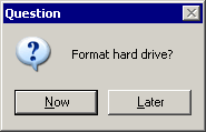
One of the unnecessary evils of GUI programming is the “Process Dialog Box” – what we think of as MessageBox.Show. You know, like this:
All kidding aside, these dialogs are frequently abused for displaying all kinds of trivial information to the user, a mistake that Alan Cooper calls stopping the proceedings with idiocy. Don’t like the data the user entered into a form? Well then, let’s immediately pop up a MessageBox and notify them about it! Thus the main form loses focus, and the user has another modal window to to acknowledge before s/he can continue doing anything with the main form. This completely breaks any flow of interaction the user had with our app.
A better solution is to passively flag the field – perhaps paint it with a pink background, or use the web metaphor of the red asterisk placed to the right of the field. Whatever you do, avoid stopping the proceedings with idiocy at all costs.
But even when following that guideline religiously, you’ll still find yourself painted into corners where you really, really need to let the user know that something happened. Right now. And the current GUI toolkit is woefully inadequate for expressing this to the user. What are my options? Display something in the status bar? The previous versions of IE6 did it exactly that way, at least for certain classes of errors such as JavaScript errors on the page. However, one of the interesting side effects of installing Windows XP SP2* RC2 is that it adds non-dialog based notifications to Outlook Express and IE6. For example, here’s IE6 notifying me that it blocked download of that crazy, dangerous Firefox browser – a clear security risk!
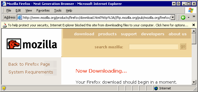
I love this solution, and I want someone to copy it immediately and make it available as a WinForms user control! There’s just no question that this is a far better solution than popping a modal dialog with the same information. It’s also better than the “put an icon in the status bar” solution, because it’s more visible, it’s at the top of the window where the work starts (nobody sees the status bar), and it contains more information. You can click it to get a menu of actions relevant to the condition, in this case, unblocking the download or turning off the notification entirely per-site or per-system.
It’s funny, because I had often considered this dialog box conundrum – which is really endemic to all GUIs – and thought back to the interface from an old computer game from 1999, Dungeon Keeper 2. The game was constantly sending you notifications of various things going on throughout your dungeon; the notifications would visually flow into a queue with a summary icon to indicate the type and severity of the notification. That way you could continue playing the game without interruption, and process the messages as you deemed necessary.
*AKA the “gee, we’re sick of getting all this bad publicity about our crappy default security settings” patch.