Comparing Font Legibility
If you're not reading the Wichita State Software Usability Research Laboratory newsletter regularly, you should be. It's an amazing source of usability experiments with actual data, hypotheses, citations, statistics, and all that other stuff that puts the science back into computer science.
A 2001 SURL experiment compared the legibility of twelve common web fonts on a then-typical 17" monitor running at a resolution of 1024x768. And before you read any further, you should first view the font samples.
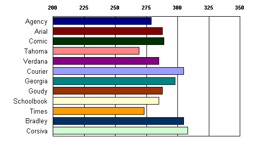
Examining the mean reading time for each font type irrespective of their accuracy, we found significant differences. The reading time difference between [Corsiva and Tahoma] was 40 seconds for approximately two pages of text. This finding of a relatively small difference in reading speed between these fonts has been consistent with our previous studies.

I'm surprised that they consider a difference of 40 seconds -- that's 13 percent of the total reading time of ~310 seconds -- "relatively small". A 13 percent difference in reading time between the pseudo-calligraphic, completely inappropriate Corsiva and Tahoma isn't terribly surprising.
But here's what is: Courier -- the only monospace font in the experiment -- was the second worst font for reading time. Courier barely performed any better than the abhorrent Corsiva! Any connection between reading paragraphs in a browser and reading code in an IDE is unclear, but it certainly doesn't bode well for the use of monospace fonts in general.
In the end, the reading speed differences between the various fonts may not be large enough to be significant. At least not for the type of reading most people do on the computer:
.. the different reading speeds associated with various font types may not be of any real consequence for short online passages -- as long as the fonts are within the conventional font size and type range.
Before worrying about fonts, be sure you aren't presenting giant blocks of text to the user in the first place. Well-designed web pages avoid using large blocks of text, and so should your code.

