UI Follies, Volume I
Occasionally I run into UI elements so boneheaded, I have to wonder what the programmers were thinking.
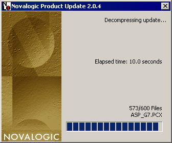
It’s a standard convention for installers to show (estimate, really) how long the install will take. That way users have some idea how long they’ll be waiting, and whether they can safely go do something else while the install proceeds. This installer bravely bucks that trend, choosing to show elapsed time:

Not only elapsed time, but elapsed time down to the tenth of a second. Way to take a useful installer convention, reverse it, and utterly ruin it. Bravo!
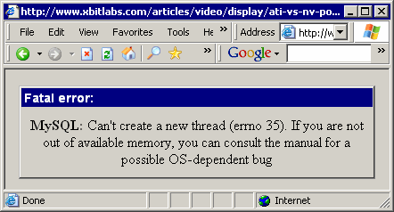
I’ve talked before about how windows apps can benefit from adopting web conventions. Well, the converse is not true: web apps should not pretend to be windows apps; they should follow standard web conventions. Well, this MySQL error page avoids those standards, choosing instead to build its own FUI:

On top of that, it’s a poor error message. I doubt “threads” or “OS-dependent bugs” mean anything to most users browsing xbitlabs articles.


