Presentation: Be Vain
Frets on Fire is an open source clone of Guitar Hero. It’s a great idea. Think of all the user-created songs we could play! My excitement quickly faded after I downloaded it and tried it out.
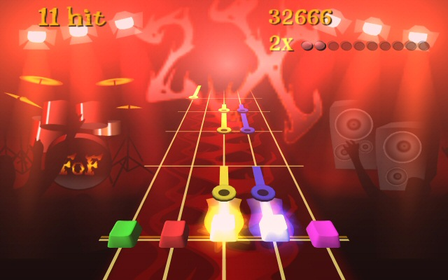
I’ll be first in line to champion gameplay over graphics, but the presentation in Frets on Fire is so bare-bones, so rudimentary that it’s hard to muster any enthusiasm for the game whatsoever. Even equipped with a nice plastic USB guitar, there’s only so much rocking you can do when you’re staring at the loose OpenGL equivalent of a completely ASCII interface. It is incredibly primitive.
For comparison, here’s a screenshot I captured of Guitar Hero III running on my PC.
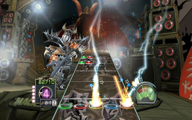
These rhythm games are functionally identical. Press some combination of the five colored buttons on the USB plastic guitar and strum in time to the pre-recorded music. It’s hardly guitar practice, but it is a fun new way to enjoy the music you already love.
Based on these screenshots, which fake plastic guitar rhythm game would you rather play?
Despite the universe of modding and custom songs possible with Frets on Fire, I’d much rather spend my time hacking new songs into the PC version of Guitar Hero III, even with the additional reverse engineering hurdles. The lesson I take from this is that presentation matters.
Of course, this comparison is grossly unfair to Frets on Fire. It is open source and completely free – whereas the Mac and PC version of Guitar Hero III costs $79.99 bundled with the guitar. There’s a commercial army of artists, developers, and producers behind Guitar Hero III. It’s unreasonable to expect Frets on Fire to have the same production values. I’m not exactly going to march over to the SourceForge page and demand my money back or anything. I applaud what they’ve done.
But playing Frets on Fire makes me feel like a keyboard jockey instead of a rock god. This isn’t just a personal deficiency of mine – it’s a presentation problem with real world ramifications. Better presentation would win many converts to the Frets on Fire camp, and woo them away from the alternatives. I think this presentation rule applies to all software. If you want people to get excited about your software, you have to make it look reasonably good, as Joel Spolsky points out:
I learned this lesson as a consultant, when I did a demo of a major web-based project for a client’s executive team. The project was almost 100% code complete. We were still waiting for the graphic designer to choose fonts and colors and draw the cool 3-D tabs. In the meantime, we just used plain fonts and black and white, there was a bunch of ugly wasted space on the screen, basically it didn’t look very good at all. But 100% of the functionality was there and was doing some pretty amazing stuff.
What happened during the demo? The clients spent the entire meeting griping about the graphical appearance of the screen. They weren’t even talking about the UI. Just the graphical appearance. “It just doesn’t look slick,” complained their project manager. That’s all they could think about. We couldn't get them to think about the actual functionality. Obviously fixing the graphic design took about one day. It was almost as if they thought they had hired painters.
I’d argue that presentation cuts a little deeper than Joel is insinuating:
“Most people make the mistake of thinking design is what it looks like,” says Steve Jobs, Apple’s C.E.O. “People think it’s this veneer – that the designers are handed this box and told, ‘Make it look good!’ That’s not what we think design is. It’s not just what it looks like and feels like. Design is how it works.”
Avoid creating software that’s beautiful on the inside but ugly on the outside. Be vain. Make something that looks as good as it works. If you pay attention to the presentation of your software, you just may find the rest of the world is a lot more willing to pay attention, too.


