Coding Horror

programming and human factors

Web 2.0 and The "Whatever Box" Server

One of the key differences between the original dot-com bubble and the Web 2.0 bubble we're entering now is that our servers are a lot cheaper and a lot more powerful. Moore's Law in action isn't exactly news, but the new web is definitely powered by cheap "whatever boxes":

In the 10 years between Excite and JotSpot, hardware has literally become 100X cheaper. It's two factors – Moore's law and the rise of Linux as an operating system designed to run on generic hardware. Back in the Excite days, we had to buy proprietary Sun hardware and Sun hard drive arrays. Believe me, none of it was cheap. Today, we buy generic Intel boxes provided by one of a million different suppliers.

We recently specced out a new server at work and I was curious about this: exactly how much more powerful did servers get in the last six years?

The parts list for our homebrew server is saved in a newegg wishlist. I set out to find a year 2000 equivalent by looking up a typical Dell server on the mid-2000 internet archive of Dell's website. According to that page, an entry-level PowerEdge 4400 server started at $4,814. I can't get to the detailed spec pages, so I'm estimating the entry-level specs based on the many PowerEdge 4400 machines for sale on eBay.

Typical 2006 server Typical 2000 server
Dual Core 64-bit CPU, 2.0 Ghz Two 32-bit CPUs, 733 Mhz
4 GB DDR400 memory 512mb PC133 ECC memory
150 GB 10,000 RPM SATA-II mirrored 9 GB 10,000 RPM UltraSCSI mirrored
1000baseT network 100baseT network
$1,743 $4,814

Now, this comparison isn't entirely fair. The PowerEdge 4400 supports real hot-swappable power supplies and hardware RAID-ed hard drives; our homebrew rig has to be powered down to switch out a failed hard drive or (single) power supply.

But the general thrust of the comparison is still valid. In a nutshell, we get..

  • 10x the network bandwidth
  • 8x the memory
  • 4x the memory bandwidth
  • 16x the disk space
  • 10x the CPU power

.. all for about one-third the price. And we have the luxury of running a commonly available 64-bit operating system in native 64-bit mode, too.

I would still argue that the the relative costs of software and hardware-- relative to the cost of human labor, I mean-- haven't changed that much in the last six years. But you can plainly see where this extravagant excess of server power makes it possible to use labor-saving software that wasn't viable in the year 2000. You can build your site on extremely high-level software, such as interpreted languages like Ruby and Python, and still scale across thousands of simultaneous user requests.. even on a single "whatever box" server.

Discussion
If the User Can't Find It...

I was lucky enough to attend a week-long Human Factors International session on usability a few years ago*. As a developer with a long term interest in getting to the human root cause of so many programming problems, I loved it. One of the freebies from the course was this button:

If the user can't find it, the function's not there

It's excellent advice. I still have this button clipped to my mug boss to periodically remind me that, no matter how cool the feature may be, if users can't find it – or understand it – you're wasting your time. So make sure you have your priorities in order before you start: usability first, feature second.

Jensen Harris provided a striking example of this phenomenon in action today:

One of the most startling and consistent pieces of feedback we've received from the early deployments of Office 2007 Beta 1 has been: "It's great that you added the drawing tools to all of the Office programs! Now I don't need to create the drawings in PowerPoint and copy them into Word/Excel/Outlook..."

Surprised? I certainly was.

While the drawing and graphics engine has certainly been massively improved in Office 2007, the same basic drawing capabilities have been available in Word/Excel/PowerPoint since Office 97. Yet, again and again we hear stories about people assiduously creating drawings in PowerPoint and copying them over piece by piece into their Word or Excel document. I remember during a site visit watching a man create a simple flowchart in Excel which should have taken 3 minutes actually take 15 minutes because of all of the cross-application, clipboard, and windowing work it took to keep moving shapes between the apps.

When is a ten year old feature suddenly a "new" feature? When users can actually find it!

* HFI also has a great technical reference section on their site, which includes the archives of their UI Design Newsletter back to 1998. It's worth checking out if you haven't done so already.

Discussion

The Cartoon Guide to.. Programming?

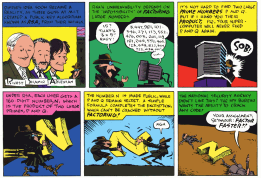
I recently found a link to a series of Larry Gonick's mathematical cartoons that were originally published in Discover magazine:

It's great stuff. Here's a sample panel from the one on cryptography:

A panel from Larry Gonick's comic 'Prime Time', about Encryption

I've followed Larry Gonick's work for ages. He's famous for his easy to grasp, beautifully illustrated treatment of complex topics – as exemplified in the series of books he's published:

Although I made fun of the Learn ASP.NET in 24 Hours meme, I am a big fan of learning subjects in cartoon form. You learn more when you're having fun doing it.

Discussion

Windows Vista: Security Through Endless Warning Dialogs

Paul Thurrott's scathing article Where Vista Fails highlights my biggest concern with Windows Vista:

Modern operating systems like Linux and Mac OS X operate under a security model where even administrative users don't get full access to certain features unless they provide an in-place logon before performing any task that might harm the system. This type of security model protects users from themselves, and it is something that Microsoft should have added to Windows years and years ago.

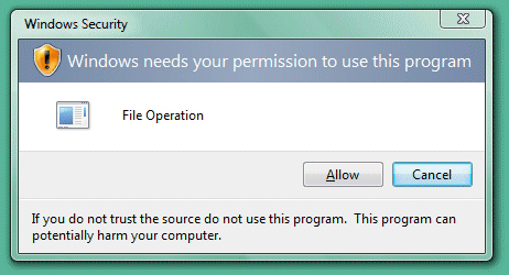
Here's the good news. In Windows Vista, Microsoft is indeed moving to this kind of security model. The feature is called User Account Protection (UAP) and, as you might expect, it prevents even administrative users from performing potentially dangerous tasks without first providing security credentials, thus ensuring that the user understands what they're doing before making a critical mistake. It sounds like a good system. But this is Microsoft, we're talking about here. They completely botched UAP.

Windows Vista permission dialog

The bad news, then, is that UAP is a sad, sad joke. It's the most annoying feature that Microsoft has ever added to any software product, and yes, that includes that ridiculous Clippy character from older Office versions. The problem with UAP is that it throws up an unbelievable number of warning dialogs for even the simplest of tasks. That these dialogs pop up repeatedly for the same action would be comical if it weren't so amazingly frustrating. It would be hilarious if it weren't going to affect hundreds of millions of people in a few short months. It is, in fact, almost criminal in its insidiousness.

We have fairly recent internal builds of Vista for a project we're working on at Vertigo, and we've run into this problem too. Even though you're ostensibly logged in as an "Administrator", you're inundated with a sea of security dialogs if you try to do anything even remotely, well, Administrator-y.

The problem with the Security Through Endless Warning Dialogs school of thought is that it doesn't work. All those earnest warning dialogs eventually blend together into a giant "click here to get work done" button that nobody bothers to read any more. The operating system cries wolf so much that when a real wolf-- in the form of a virus or malware-- rolls around, you'll mindlessly allow it access to whatever it wants, just out of habit. As Rick Strahl notes, this is the ultimate form of nagware:

Then there are the security dialogs. Ah yes, now we're making progress: Ask users on EVERY program you launch that isn't signed whether they want to elevate permissions. Uh huh, this is going to work REAL WELL. We know how well that worked with unsigned ActiveX controls in Internet Explorer – so well that even Microsoft isn't signing most of its own ActiveX controls. Give too many warnings that are not quite reasonable and people will never read the dialogs and just click them anyway… I know I started doing that in the short use I've had on Vista.

But there's an even deeper problem lurking under the surface. Why doesn't Vista respect my choice to be an Administrator? Who is really in control here: me, or my operating system? There's something awfully paternalistic about an operating system that lets me log in as an Administrator, but treats me like a regular User. If you're going to treat me like a User, at least have the decency to create a regular User account for me. That would certainly make more sense.

Rick Strahl confirmed that, indeed, Vista downgrades Adminstrators to regular Users by default, in a misguided attempt to enhance security. He also posted a workaround that applied only to the Vista Beta. But the good news is that in the final, released version of Vista, it's quite easy to disable UAC:

  1. Launch Control Panel
  2. Type "UAC" in the search box at the upper-right hand corner of the window
  3. The option to disable UAC is the first search result.

Then log off and log back on.

I seriously hope Microsoft reconsiders these bizarre policies before Vista is released, but sadly they did not.

  1. Let administrators really be Administrators!
  2. Create all new users by default as plain Users. If a user opts to upgrade to an Administrator, that's the appropriate time to pop the scary warning dialog.
  3. If a user tries to do something that requires Administrator rights, show a dialog telling them so, and offering links to a) log in temporarily as an Admin, or b) enter the Admin credentials in-place for a quick one time operation.

It could be so much simpler if Microsoft just followed the established conventions.

Discussion

Remote Desktop Tips and Tricks

I'm with K. Scott Allen: the pervasiveness of Remote Desktop functionality in Windows has fundamentally changed the way I work.

The fact that it shipped in the Windows XP box-- and as a default component of all the server operating systems since Windows 2000-- has done wonders for its adoption. It's truly ubiquitous. And it doesn't hurt that it's actually the best performing remote control tool I've ever used; I have yet to try any other remote control tool that performs as well. It's so responsive that it almost makes the idea of physically sitting in front of a computer seem quaint.

Almost.

One thing you quickly learn with Remote Desktop is that not all the windows shortcut keys work as you would expect them to. The "Apply Windows key combinations" setting defaults to "full screen only", so you may see different behavior depending on whether or not you're running full-screen; use the Ctrl+Alt+Pause shortcut to switch back and forth.

The help file contains a list of the special Remote Desktop key combinations:

Alt + Page Up

Switches between programs from left to right.

Alt + Page Down

Switches between programs from right to left.

Alt + Insert

Cycles through the programs in the order they were started.

Alt + Home

Displays the Start menu.

Ctrl + Alt + Break

Switches the client between a window and full screen.

Ctrl + Alt + End

Brings up the Windows Security dialog box.

Ctrl + Alt + Pause

Toggles between fullscreen and windowed mode
(note that this does not set the client desktop to the correct size)

Alt + Del

Displays the Windows menu

Ctrl + Alt + Num -

Places a snapshot of the client's active window on the clipboard

Ctrl + Alt + Num +

Places a snapshot of the client's entire desktop area on the clipboard

To shut down or restart the remote computer, either bring up the Windows Security dialog , or use Task Manager.

Scott also provides a great list of additional resources for hacking Remote Desktop:

I have two tips of my own. The first has to do with multiple monitors. Both my work and home computers have three monitors. Before you laugh, guess who else was on the three monitor tip back in the day? Google's Larry Page. And Bill Gates. At any rate, I've gotten at least one email on this, so I know it's not easy to figure out. Here's how you run a remote desktop session maximized to a particular monitor:

  1. Start a windowed (non-fullscreen) remote desktop session
  2. Drag the windowed session to the monitor you want
  3. Close the remote desktop session
  4. Set the properties for the connection to "full screen". It must be "full screen", not the actual resolution of your monitor (1280x1024, etc).
  5. Start a remote desktop connection; it'll be full screen on the target monitor

I know it's convoluted. But at least it remembers which monitor it is full screen to. It'd be simpler if we had a way to change the client desktop size without closing and re-opening the connection, say via the display properties dialog. But we don't.

Here's my second tip: if you're not on a fast LAN, drop the color depth down to either 256 or 15-bit color, and select "Modem" on the Experience tab. Color depth is the single biggest contributor to performance over a slow connection. You may be tempted to go to 16-bit color or even 24-bit color to make things look prettier, but remember all those additional bits have to be transmitted across the wire. I know 256 colors can look desperately bad with most of today's websites and applications-- but 15-bit color is a good compromise.

Discussion